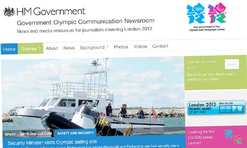
The run-up to the Olympic Games starts in earnest today, with the arrival of the flame on British shores – and Whitehall is opening up its dedicated Government Olympic Communication operation, providing ‘a single point of contact for London 2012-related media enquiries … until the end of the Paralympic Games on 9 September.’ There’s a dedicated press team, drawn from across Government – and a dedicated website, which I’m genuinely proud to say we built.
DCMS asked us for a site which could draw together the many streams of information – text, photo and audio – already being produced in government, and make them easy for journalists to explore. Many departments were issuing press briefings, or posting fantastic material on Flickr or YouTube, but there was no easy way to browse through it, or conduct targeted searches.
Cue some WordPress-powered magic. 🙂
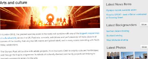
A trained eye will spot our heavy use of custom post types. Some, like ‘backgrounder’ were fairly straightforward, identical to posts or pages, but separated out for convenience. Others, like ‘theme’ and ‘region’ were more complex – and were also sync’ed up to custom taxonomies, allowing us to ‘tag’ other post types as being relevant to a given theme/region. We then interfere with WordPress’s default selection of display templates, to show collated results pages: editorial on one side, search results on the other.
Here’s an example: a ‘theme’ page, showing relevant results from the other post types.

There are specific custom post types for photos – specifically Flickr; and videos – specifically YouTube. (Why these two? Because pretty much every department is already using them.) And in both cases, we’ve written custom code to interface directly with the host sites’ APIs, making the process of adding new material a breeze.
Let’s take YouTube, for example. Editors simply click ‘Add New’, then paste the URL of a YouTube clip’s page into a clearly labelled box. We extract the clip’s unique ID, then query the YouTube API to get its thumbnail, which we save as the WP post’s featured image; and the YouTube-recommended embed code. Couldn’t be easier.
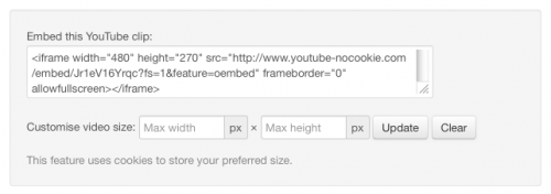
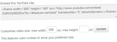
Then, when you view the clip’s page on the site, the video gets embedded automatically – and we display the YouTube embed code, for journalists or bloggers to take away to their own sites.
We let the journalists and bloggers customise the embed’s dimensions via an ajax call back to YouTube; so if you need a clip to be a certain size, we’ll recalculate the width and height accordingly. We store your preference using a cookie – meaning that now, every time you look at a video page, the embed code is pre-customised for you. 🙂

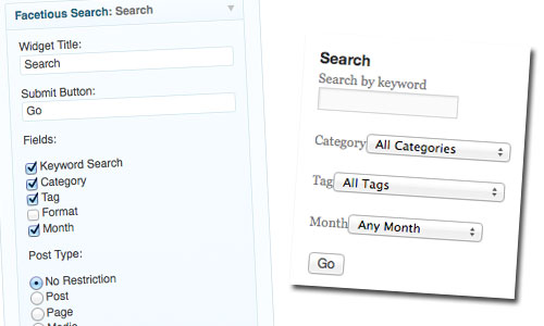
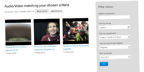
Then there’s the multi-dimensional search function. Each post type has a number of taxonomies associated with it: theme, region, originating department, and so on. So when you’re browsing, say, the photo archives, you can specify that you want photos on a given theme… or from a given region… or by a given department… or in a given month. Individually, or in combination.

It’s the first time we’ve tackled this kind of ‘advanced searching’ functionality, and it probably doesn’t sound all that complicated: but I can assure you, it is. 🙂
It’s also the first time we’ve delivered a responsive design on a client site. We originally planned three versions: phone, tablet and desktop. But a late change of code base, and (to be honest) questions over its real value, led us to drop the tablet view. For the most part, it’s just been a case of un-floating the various blocks in the layout grid – but a few elements, like the primary navigation and homepage carousel, needed a bit more work. Give it a try if you’ve got a smartphone handy; or resize your (non-IE) browser to a really narrow size. It should kick in at 480px width.
Behind the scenes, working with our very good friends at CatN Hosting, we’ve added a Varnish cache – just in case there’s a sudden huge leap in traffic. Hopefully it won’t ever be required. But for the same reason they’re putting missiles on top of east London tower blocks, we’re planning for a worst-case scenario.
My thanks to Nick at DCMS/GOC for commissioning us, and protecting us from the internal wrangling. To Joe at CatN, for leaping into action when called upon, and for very kindly volunteering to help with Varnish. And to the G-Cloud process, directly and indirectly, for its help in buying Joe’s services. To the other clients who, knowingly or not, contributed ideas and code to the site’s development. But most of all, to designer Laura Kalbag, who developed the visuals and did the bulk of the front-end functionality. You’re all wonderful.
Let the Games begin.
This has been a Code For The People production.
