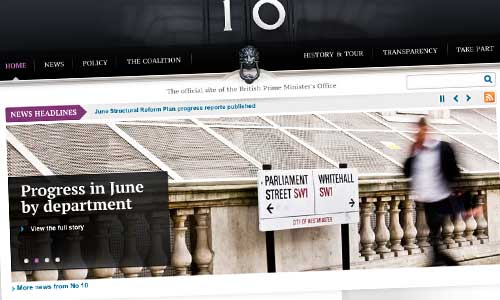
Very quietly last week, Downing Street launched a new design for number10.gov.uk – but to my own great relief, and (happily!) contrary to my prediction of last December, it remains very much on WordPress.
Visually, I personally think it’s a great improvement, with bold use of the iconic 10, now complemented by the lion door-knocker. It looks a lot more head-of-statey: with the central alignment of the ‘logo’, and the capitalised primary navigation, I can’t help thinking of the White House a bit… but maybe that’s just me. It’s also nice to see a non-standard font in use – the free PT Serif.
One of the new site’s most striking aspects is the way it seeks to represent government policy across departments – see, for example, this FCO page. If we didn’t know that BIS’s Neil Williams has only just started looking at this area, you’d be left wondering if this was the next stage of the Alphagov vision, with No10 taking control of all policy presentation. These pages look like WordPress pages (or a similar custom post type), with the sidebar news stories being pulled in automatically via tags (or a similar custom taxonomy).
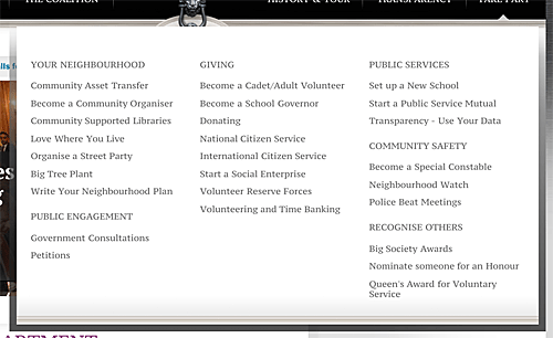
And it’s intriguing to see Prime Ministerial initiatives being represented up-front: ‘TAKE PART’ is one of the handful of primary nav headings, and includes some very Cameron-y elements (which one wouldn’t previously have expected to see on the No10 site):

Apart from the animating slideshow (which in my mind doesn’t count, somehow) there’s no actual ‘news‘ content on the homepage, and not that much of Cameron himself – which might be indicative of a change of target audience, away from the Westminster Village? And whilst static icon-based links point out to Twitter, Facebook and Flickr, I note the virtual disappearance of video content from the site: no Number10 TV, not even a YouTube link. (Although to be fair, it’s still there on the sitemap.)
The front end doesn’t give much away, in terms of what lies behind (boo! not fair!); but I sense there’s a fair bit of hard-coding going on in certain page templates, not least because the source code is very neat. Plus the page generation times, as reported by WP Super Cache in the source code, also look extraordinarily quick… usually measured in hundredths of seconds, which is impressive by anyone’s standards.
My only criticism – and it’s a very mild one at that – is that there seem to be a few missed opportunities to do things ‘the WordPress way’. The primary navigation, for example, looks hand-crafted, where it could surely have been done as a custom menu – meaning changes are dependent on the technical team editing the theme code, rather than the editors using the admin interface. But we’re mainly talking about the potential for things to be problematic in due course, rather than already causing problems already.
I understand it’s been done almost entirely in-house: in which case, hearty congratulations to the Cabinet Office team. I never doubted you. 🙂


