Commenting is not crowdsourcing

I’ve noticed a lot of people getting quite agitated by this Guardian piece about how the Programme for Government ‘crowdsourcing’ (sic) exercise has ended ‘without a single government department expressing a willingness to alter any policy’.
Now, I’m speaking for nobody but myself here – but what the Guardian piece doesn’t fairly reflect is that it was not a crowdsourcing exercise, nor even a consultation.
It was the definitive statement of the outcome of negotiations between the two parties currently forming the country’s coalition government. It was not ‘give us some ideas for what you think we might have agreed.’ The comment box provided an opportunity for people to voice opinions or ask questions, and government promised it would listen.
There was no commitment to take the responses back for a second round of coalition negotiations. To do so would have been quite ridiculous. So I’d argue that it’s entirely reasonable for the departmental responses to take the position of ‘well, we’ve heard what you say, but…’.

Coalition brand identity


Back in May, I wrote a piece about consistent government branding. Given the benefits in terms of cost savings and strengthened identity, I suggested: ‘it’s an idea whose time has come, and will not come again for some time.’ A couple of months later – after several web projects, a print item or two, and now even public events – it looks like we’ve got one.
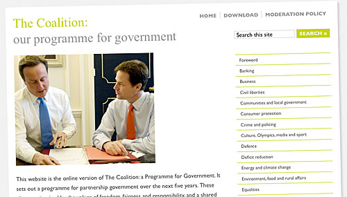
I’ve already told the story of how I put together the Programme for Government website in under 24 hours. In the early evening before publication the next morning, I received a PDF of the proposed print output – and could really only mimic it. There wasn’t going to be time to get approval for anything else. A 2:1 wireframe, white ‘page’ hovering on a very light grey background, extra large Times Roman text in the top left, green highlight colour, Gill Sans body font (where available). Nothing too clever on either the technical or aesthetic fronts.
We then had the initial Spending Challenge site, which looked almost identical, not surprising given that it used my original CSS code… followed by the two discussion apps based on Delib’s platform, both coded from scratch but again using the same defining elements – 2:1 wireframe, white page on grey, big Times New Roman logotype, Gill Sans where available.
(It was particularly amusing to see the Delib guys sticking with the page shadow effect. Well past midnight, amid last-minute doubts about the design lacking a certain something, I added this using CSS3’s box-shadow. It took a few seconds to add to the CSS; it looked OK, and my creative juices had run dry – I wasn’t going to come up with anything better. Lo and behold, it’s one of the style’s defining characteristics! – although to Delib’s credit, they went back and did it ‘properly’ as a repeating background graphic.)
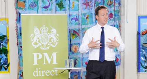
And now I note the same style has even been translated into event scenery: witnessed first at the Cabinet away-day in the North, then again last Friday in Cornwall.
The outside observer would have to conclude that this is HMG’s new across-the-board House Style… or certainly, the makings of one. There’s a lot to like about it, not least its easy online application; there’s something inherently ‘British’ about Gill Sans, and the colour combination blends sobriety and dynamism quite well. But some refinement is still required: I don’t think we’ve found quite the right green, for example.

Commentable Coalition plan


Out of the blue last week, I got a call from COI: was I available for an immediate, rapid turnaround WordPress job? I was a bit startled, and detail was lacking; but since this was precisely the kind of rapid-response thinking I’ve been trying to foster around WordPress for a couple of years, I couldn’t really say no.
As it turned out, the project in question was the Coalition Programme for Government: and the mission was to build a commentable version of it, by the next morning. COI’s initial proposal was to use Steph’s Commentariat as a base; but given the document’s structure, it didn’t feel like a good fit. Plus to be honest, I knew I’d be more comfortable working with my own code, as opposed to unpicking Steph’s – and time was too tight.
The theme came together fairly quickly, helped in no small part by the source document’s fairly plain design – which I basically mimicked, with a couple of tweaks for better web usability. Extracting the text from the supplied PDF was excruciating, as you’d expect. But by the time I got to bed at about 2.30am, having barely left the keyboard since lunchtime, the site was ready, and my part of the work was basically done. It went live at 9:30 the next – well, technically the same – morning.
Now… I’m going to skip over the next bit, because I’m not the right person to tell the story. Suffice to say, people came in their many tens of thousands. And although measures had been taken to handle the expected load, the platform wasn’t ready for quite that volume of interest.
But now, a couple of days older and wiser, the site has been re-enabled: and the comments are starting to come in. This in itself presents some interesting challenges: the document is, by its very nature, more party-political than most, and the comments will be too. The civil service’s usual get-out clause – about the government being democratically elected, on the basis of its manifesto (singular) – doesn’t really work this time. Thankfully, applying the moderation policy is someone else’s problem.
Of course it’d be nicer if things had gone perfectly smoothly on launch day. To some extent, we’ve missed the boat in terms of the immediate wave of interest; but arguably, the comments might be more considered, with the benefit of a weekend to reflect and cool off. (Well, not ‘cool off’ given the mini-heatwave, but you know what I mean.)
And regardless of what went wrong, there’s still a great story to tell, in terms of what went right. An interactive document, designed and coded from scratch, and delivered by bedtime. That’s why we love WordPress.