Back in May, I wrote a piece about consistent government branding. Given the benefits in terms of cost savings and strengthened identity, I suggested: ‘it’s an idea whose time has come, and will not come again for some time.’ A couple of months later – after several web projects, a print item or two, and now even public events – it looks like we’ve got one.
I’ve already told the story of how I put together the Programme for Government website in under 24 hours. In the early evening before publication the next morning, I received a PDF of the proposed print output – and could really only mimic it. There wasn’t going to be time to get approval for anything else. A 2:1 wireframe, white ‘page’ hovering on a very light grey background, extra large Times Roman text in the top left, green highlight colour, Gill Sans body font (where available). Nothing too clever on either the technical or aesthetic fronts.
We then had the initial Spending Challenge site, which looked almost identical, not surprising given that it used my original CSS code… followed by the two discussion apps based on Delib’s platform, both coded from scratch but again using the same defining elements – 2:1 wireframe, white page on grey, big Times New Roman logotype, Gill Sans where available.
(It was particularly amusing to see the Delib guys sticking with the page shadow effect. Well past midnight, amid last-minute doubts about the design lacking a certain something, I added this using CSS3’s box-shadow. It took a few seconds to add to the CSS; it looked OK, and my creative juices had run dry – I wasn’t going to come up with anything better. Lo and behold, it’s one of the style’s defining characteristics! – although to Delib’s credit, they went back and did it ‘properly’ as a repeating background graphic.)
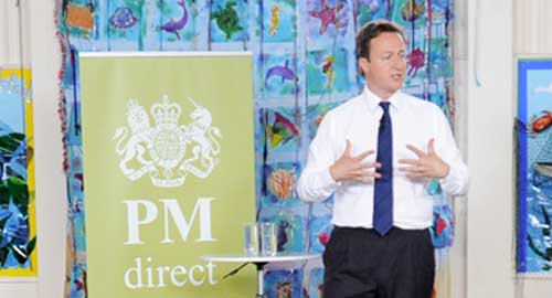
And now I note the same style has even been translated into event scenery: witnessed first at the Cabinet away-day in the North, then again last Friday in Cornwall.
The outside observer would have to conclude that this is HMG’s new across-the-board House Style… or certainly, the makings of one. There’s a lot to like about it, not least its easy online application; there’s something inherently ‘British’ about Gill Sans, and the colour combination blends sobriety and dynamism quite well. But some refinement is still required: I don’t think we’ve found quite the right green, for example.


