Last night I resigned from WPUK, the coordinating body which emerged from the organisation of the first few UK WordCamps.
In 2008, I felt genuine excitement at the thought that the UK WordPress community had grown big enough to justify its own WordCamp; and I think it was right to focus the community’s collective efforts on a single national event through those first few years.
I put my money where my mouth was, too: initially as Puffbox Ltd, then as Code For The People, I have been a corporate sponsor of every WordCamp UK.
However, things move on. A number of city-based meetup groups were formed, and began to flourish: Manchester, Sheffield, Liverpool, Brighton, London, Scotland, my own Whitehall-centric affair even. Any one of them could easily have ‘graduated’ to operating a WordCamp. (None did, for whatever reason, until this autumn.)
I continued to defend the ‘one national WordCamp’ position, in the face of opposition from some of my best friends in this business. It was the right thing to do, I argued, until somebody proved it was wrong – by successfully organising another UK event.
In November 2013, I was one of the group which proved it was wrong, by successfully organising WordCamp London.
It came as quite a surprise last week when, out of the blue, I received an email notification of a vote being called among the members of the WPUK ‘core group’ – a 10-strong, effectively self-selected bunch. We were asked:
Do you agree that WPUK continues as a naturally evolving organisation, and that WPUK instigates as soon as possible the organisation of the follow up to WordCamp Lancaster UK 2013, to take place on 12-13 July 2014 at a venue to be decided?
For a year or more, I’d been trying to get the group to reconsider its purpose. Numerous times I’d tried – and failed – to start a constructive debate about the group’s purpose. More often than not, the debate turned startlingly hostile and viciously personal. I couldn’t wait to get out; but I hoped the successful running of a London WordCamp would prove that WPUK had run its course.
The calling of this vote forced my hand somewhat. It wasn’t especially well worded – but it did get to the heart of the matter. Did WPUK exist to designate a single event as being the one officially sanctioned WP event for the UK in 2014? To run an Olympic-style bidding process among candidate cities, as it had done in previous years (with, to be blunt, variable levels of success)?
Calling the vote came as a surprise. The fact that the group voted 6-4 in favour, even after the success of WordCamp London, was a genuine shock.
The group has decided that a bidding process, in which one event ‘wins’ and the others – no matter how viable in their own right – ‘lose’, is still the right way to go. I could not disagree more strongly.
I believe that it’s now actively harmful to the development of sustainable ecosystems around the country. And I believe that it flies in the face of all available evidence.
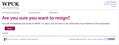
So I did the only honourable thing, and resigned my position immediately.
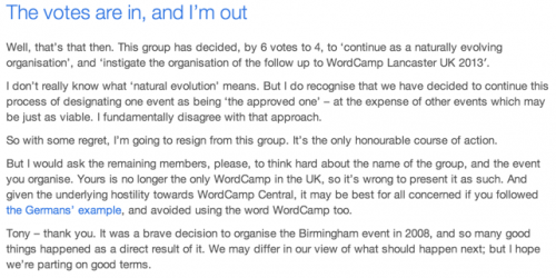
And as I’ve been writing this post, Siobhan McKeown has followed suit. I believe at least one other will be doing likewise, if he hasn’t already done so. Those with the closest ties to the WordPress project are leaving the group. Make of that what you will.
I really hope things don’t now turn nasty. Past evidence suggests they might.