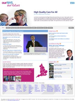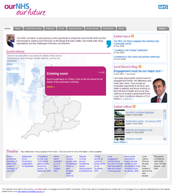
Puffbox’s latest project in the health sector is Care Support Independence, a WordPress-based website in support of the forthcoming green paper on funding and delivering social care. Sadly though, I can’t present it as another victory for WordPress, as it’s a rebuild of a site that already ran on WP.
The original CareAndSupport website was launched last summer; but truth be told, it had fallen off the rails a bit since. I was asked to rework the site, following the very successful model of the Our NHS Our Future site built for Lord Darzi’s NHS review – and, perhaps crucially, giving hands-on control to the team’s experienced in-house writer.
At least to begin with, we’ve consciously kept the design very close to what went before: bold blocks of colour, rounded corners, fairly plain text on a white background. This should make people feel more comfortable in the transition from old site to new; and it has allowed us to concentrate on the mechanics of the move. The new WordPress theme – built from scratch, as usual – is a wonder of minimalism, with all pages (bar the homepage) being rendered using the same index.php template: it should make it much easier to step up a gear when the green paper is published.
It’s the first time I’ve built pages using Yahoo’s YUI Grids CSS – and it certainly won’t be the last. It made laying out the page as easy, and as reliable cross-browser, as old-skool table markup. Have a play with this excellent ajax-powered grid builder to see how it all works; if you like it, I highly recommend this one-page cheat sheet. It’s a pretty good story in terms of HTML validation, too: the only error picked up by the W3C validator is the use of aria-required in the default WordPress comment template.
Having moved the site successfully, we can start thinking more ambitiously about future functionality, design and content. There’s a clue as to the direction of our thinking in the link to the team’s Facebook group.

 This afternoon sees the effective conclusion of Lord Darzi’s year-long (ish) review of the National Health Service, under the
