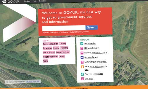
The GDS project to build a ‘single government domain’ website passed from alpha to beta phase in the final few hours of January 2012. And as with the alpha, it’s all open to the public – you’ll find it at http://www.gov.uk, which still looks rather odd, and feels very strange to type. I guess I’ll get used to it.
Writing on the GDS blog, Tom Loosemore describes it as ‘ the next step on the journey’, but of course, that’s a bit of an understatement. An ‘alpha’ build, such as was unveiled last year, makes no promises. By definition, a beta is much closer to what its creators consider to be their eventual vision. The stakes are higher, much higher this time.
Thankfully, it’s looking great. It’s no surprise to see the defining characteristics of the alpha still in place – notably the placing of emphasis on tools rather than text, and search rather than navigation. And it’s in these that you find the platform’s real strengths.
‘Quick answers’, such as this Student Finance Calculator perfectly illustrate the revolution that this ushers in. For too long, government websites have sought to provide inch-thick documents instead of single-sentence (or even better, one word) answers to the user’s specific question.
(Remind me to blog about the ‘do I need a visa?’ questionnaire I built in 1999, whilst at the Foreign Office – and still visible, hurrah!, via web.archive.org. And a dozen years later, presumably after serious reconstructive surgery, it’s still going strong albeit in a new home.)
And it goes without saying – the predictive search mechanism is excellent. But then again, it has to be. Once you’re beyond the homepage, there’s next to no clickable navigation. This is the ‘Google is the homepage‘ credo gone fundamentalist.
For those of a technical mind, James Stewart has listed the technology it uses; and I’m grateful to Harry Metcalfe for the tip-off that interesting things happen if you stick .json on the end of a URL.
I for one welcome our new online overlord. 😉

(Plus, it gave me an excuse to play around with the excellent Bootstrap web framework, open-sourced by Twitter last year. I love it, although it’s highly likely to make your website look a lot like Twitter.)
Response
Hi Simon, you mention the student finance calculator on gov.uk. It’s certainly very straightforward to use. However, students in Wales still currently get their own website:
http://www.studentfinancewales.co.uk
It contains a similar body of information to the student finance section currently on Directgov, for English students –
http://www.direct.gov.uk/studentfinance
The difference is that the Welsh goverment’s version has got its own colours, branding, graphics, tailored content and information architecture. You won’t find that on directgov or the gov.uk website.