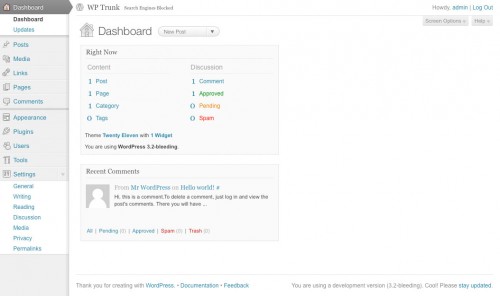
WordPress takes the ‘open’ in ‘open source’ very seriously: discussion of functionality and design changes happens in public, and it’s always possible to download and play around with the next version in its current form.
Development work on version 3.2 (set for release at the end of June) is approaching completion, with a couple of significant additions in the last day or so: namely, a bit of a design refresh on the admin side, and a new default theme – named Twenty Eleven, but actually it’s the Duster theme which was added to wordpress.com in February.
I’ve played around with the new admin design for a bit this morning, and there’s really not much to report. It’s instantly familiar, and everything’s in exactly the same place (more or less) – but it does feel just a little bit more modern, and I suppose it’s good to keep driving forwards.
But there’s an issue which government folks may need to note: this release marks a conscious step away from IE6 (on the back end).
We probably can’t drop much CSS, as IE7 shares a lot of the issues. This is mostly symbolic, and reduces the platform combos we need to test. This also means any security issues that are shown to only affect IE6 only can be lowered in priority.
– Mark Jaquith, March 2011
This won’t affect what IE6 users see on the front end, as that’s dictated by the theme rather than WordPress itself. And it doesn’t mean the admin side will instantly become unusable in IE6. But the security warning alone should be enough to force remaining stragglers to upgrade.

Oh – and one more thing. There’s a really beautiful new ‘distraction free’ authoring view in 3.2. In WordPress currently, there’s an icon on the toolbar which looks like a blue monitor screen. When you press it, the text-editing box goes ‘full screen’, with a row of buttons along the top… just like Word. Well, 3.2 takes that a few steps further, and it’s gorgeous.
Responses
I’ve been following trunk pretty closely for a while after I spotted Mark Jaquith’s comment about dropping IE6 compat and after updating again today, I noticed the updated UI. My first impression was ‘hmmm, I’m not sure I like it.” From an aesthetic point of view it just didn’t appeal to me. It looks like they’ve tried to ‘modernise’ it but instead of fallen foul of ‘more is more’. The ‘shadow’ they’ve placed to the right hand side of the side nav just doesn’t work (strictly in my opinion of course). The nav now seems to go underneath the content on the right, which may have been the intention. The updates that have been made to the widgets seem to have ‘flattened’ things.
Maybe it’ll grow on me.
One thing that wont grow on me is the dropping of IE6 support. You mentioned above that it will drive people to upgrade. As you know full-well many people don’t have that option. I have several NHS-based clients who simply can’t do that.
So where does that leave me? I’m going to have to have to produce an admin skin which DOES work effectively in IE6. Or at least do my best to make it workable as ‘not updating’ simply isn’t an option.
I understand WHY the UI team has chosen to go down this path and I’ve dropped IE6 support by default for all of my other projects for months now. Perhaps this is one of the reasons why I have a slight dislike to the new UI – the fact that I know it’s going to create me more work.
The new ‘distraction free writing’ screen is, however, beautiful. A huge improvement on that side of things and everyone involved with that should be applauded.
@ Simon
I was just wondering if you’ve got any tips on WordPress search? Looking to find something a bit better than the out of the box solution and have come across http://www.yolink.com/yolink/ – any thoughts?
Thanks in advance – Paul
Hi Paul: sorry, no experience with Yolink… but there’s always Google’s own Custom Search Engine service? I’ve rattled off a *very* quick edition of this, allowing you to search this very website: /search
You’d probably want/need to refine it a bit, to eliminate tag and category indices perhaps, but the basis of a good solid relevance-based search engine is there within a matter of minutes.
Thanks Simon – definitely better than the default. I’ll let you know how i get on with YoLink as well.