The world of Liberal Democrat websites is dominated, almost monopolised, by one company – Prater Raines, based in Folkestone. They offer local LibDem parties a corporate website template, plus mailing list facility, plus a shared photo library, plus hosting, plus email, plus DNS, etc etc, for a staggeringly low £250 (ish) a year. When a local party’s key concerns are typically ‘can it do what we need?’ and ‘can we afford it?’, their success is understandable: they host something like 600 sites in the extended LibDem family.
The catch is that every site on the Foci platform, as it’s known, looked more or less identical – which might be fine if that shared look-and-feel was any good. Unfortunately, to be frank, it wasn’t. Being charitable, the sites had begun to look very, very dated: tabular, text-heavy, and lacking in finesse. A clear case of technology first, design a distant second: laudable in some respects, but just not how the game works.
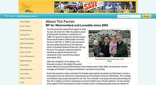
A revamp has been in the works for many months – since long before the general election, in fact – and finally this week, it’s been rolled out across the network: see the examples of Tim Farron, Don Foster, Sarah Teather or the specially souped-up site for Vince Cable. And in a word, it’s underwhelming.
The boxy, full-width layout is gone, replaced by a centred, 1024px-optimised format, sometimes single-column, sometimes two, sometimes three – so far, so good. There’s a hint of gloss in some of the screen furniture, some rounded cornering, even a bit of text-shadowing on the occasional headline. But there’s a definite feeling that they’ve bolted these ‘cool’ elements on top, without really buying into them.
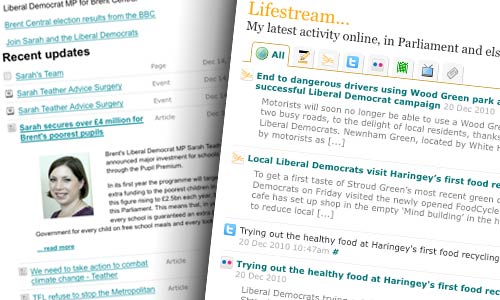
Perhaps the best illustration of this is the aggregated list of site updates, which they’re calling homepage ‘lifestreams’. Hang on… homepage lifestream? Yes, they’ve clearly been inspired by my invention for Lynne Featherstone… except they’ve totally missed the point of it.

Lynne’s lifestream pulls together her activity from multiple third-party sources: it helps readers see what she’s done lately, wherever she might have done it, and at a glance shows her to be very active across multiple social networks. But theirs seem to do no more than aggregate the different content types within the same site: and the token effort to distinguish the different content types fails, because the icons just aren’t strong enough. It’s just a list.
Ah – but then there’s the jQuery-based hover-to-slide thing. As you hover over each headline in the ‘lifestream’ (ahem), it quickly expands downwards to show the ‘excerpt’, and the previous one closes up. If you’re mousing over the list to get to a specific headline, it can be quite nauseating. But more importantly – it actually makes it harder to click on the link you’re interested in. Sometimes you’ll mouse-over your chosen link, only to find it gets moved by the animation, and you’re now clicking on something else… and the headline you wanted may well have disappeared off the bottom of the screen.
Prater Raines deserve a huge amount of respect for their success in this field. Their tremendous economies of scale have allowed them to put together an offering which is, to all intents and purposes, unbeatable. They clearly know their technology. But this was the opportunity to make up for their offering’s presentational shortcomings, at precisely the moment when LibDems, locally and nationally, need a presentational boost… and they haven’t taken it.