The biggest surprise about the transition to the new coalition administration is how few surprises there actually were. A quick tour of the departmental websites reveals, for the most part, the exact same websites that were there before – albeit a little lighter on content, and with new faces in the About Us section. It’s all gone commendably smoothly.
But one or two departments have taken advantage of the situation to revamp their web presences: and it’s been our pleasure to assist with one of these already – with more, perhaps, to follow.
In the run-up to Polling Day, we were asked by COI to provide cover for any ’emergency’ web building which might result from the arrival of a new administration. Steria provided a hosting environment, with WordPress MU pre-installed; and I worked with Zed1’s Mike Little to develop a theme which could be deployed and managed centrally, ideally very rapidly – but still be easily customisable for each individual site which used it.
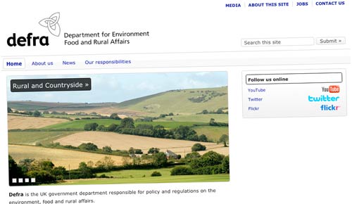
In the end, there weren’t any major Machinery of Government changes which required it: but Defra recognised the opportunity, and are using it as a base on which to start rebuilding their corporate website. They’ve worked with Puffbox on a few WordPress-based microsites already this year, so it’s familiar territory for them – and in truth, I think it’s been coming for a while.

The theme is fairly plain, sober and generic: inevitably, given that we had literally no idea who might need to use it, or how. There’s a rather nice homepage carousel, managed via the WP media library; a widget-ised sidebar and ‘fat footer’; plus special page menus at the top and bottom. It makes for quite a nice little site: certainly enough to get things started.
But whilst the design itself might not win awards, the behind-the-scenes stuff is pretty smart. We’ve enabled WordPress’s ‘custom header’ functionality on the theme: users simply need to create a graphic of predefined dimensions, upload it into WP, and it’ll be used as a full-width banner across the top (with the search form and – optionally – department name overlaid). In Defra’s case, they’ve gone for a fairly plain black logo on white; but it could have been a lot more creative if they’d wanted. When we’ve tried this in test, we’ve found it can produce quite dramatically different ‘feels’ to the theme.

And then there’s the colour palette. The theme’s style.css file avoids defining most of the colours used on the page. Instead, there’s an options page in the WordPress backend, where you can enter the colours to be used for specific page elements: links, the ‘blobs’ in the sidebar and ‘fat footer’, and so on. These are saved in the database table of options for that specific blog only; and the custom CSS gets added to the top of each page as it gets generated. (It’s effectively an evolution of the work I did for BIS on Science & Society, but it takes the concept to a whole new level, and opens up all sorts of possibilities.)
But of course, the most significant aspect is the centrally managed hosting environment, and the official recognition of WordPress as a suitable tool for the job. Precisely what I’ve been proposing on these pages for ages. And you know what? I think it actually worked.