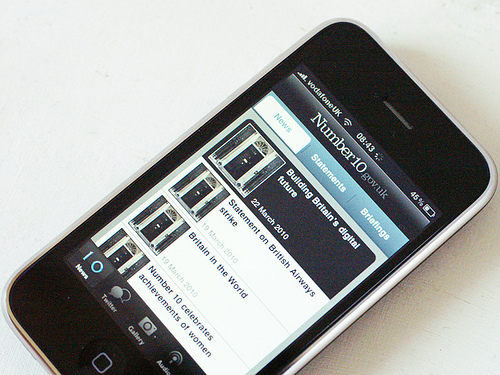
I finally gave in, and upgraded the company’s iPod Touch for the purposes of testing the brand new iPhone app from 10 Downing Street. And then, as I spent an hour randomly resetting and restoring, I promptly remembered why I hadn’t upgraded for so long. Anyway…
On a technical level, the Number10 app is actually quite modest – just a pretty front end on its website’s RSS feeds, and the feeds from its YouTube, Flickr and Twitter accounts. But it’s really very pretty – and that kind of thing matters in the world of the iPhone. It feels like a perfect blend of native iPhone interface and the parent website’s house style.
It follows, coincidentally I’m sure, in the wake of recently-launched apps by both Labour and the Conservatives – and I’d say it’s the best of the three. The Tories’ somewhat dazzling effort may have more glitz, but the Number10 app feels better in terms of information delivery: and I like its one-click sharing button to send details to your Twitter and Facebook chums. (It’s quite surprising that neither the Labour nor Tory apps have sharing buttons.)
Not entirely sure who it’s aimed at, or what specific purpose it serves, other than providing an iPhone-optimised interface on those various web presences: but the same criticism can be levelled at many such ‘corporate’ iPhone apps.
Response
iPhone apps are all the rage it seems, but I think probably just because someone holding the budget fancies a play. They’re not – to my mind – a reasonable use of public money, as they they have a huge accessibility issue (you need an iPhone!). Delivering a ‘small-screen’ version of sites for mobile would be a better option – _if_ there’s a clear need to do so…