Today’s publication of the new primary school ‘league tables’ hasn’t had huge amounts of media coverage; arguably because there’s too much other political news going on (the US Iraq report, Blair’s trip to Washington, yesterday’s Pre-Budget Report, etc). Cynics might suggest the timing is less than coincidental, since the story’s top line (as reported by the Beeb) is a missed government target.
 But the publication of the new league table data on the Department for Education and Skills website is a bit of an e-government breakthrough. Oh, and let’s get this out of the way: it’s mostly my fault. 🙂
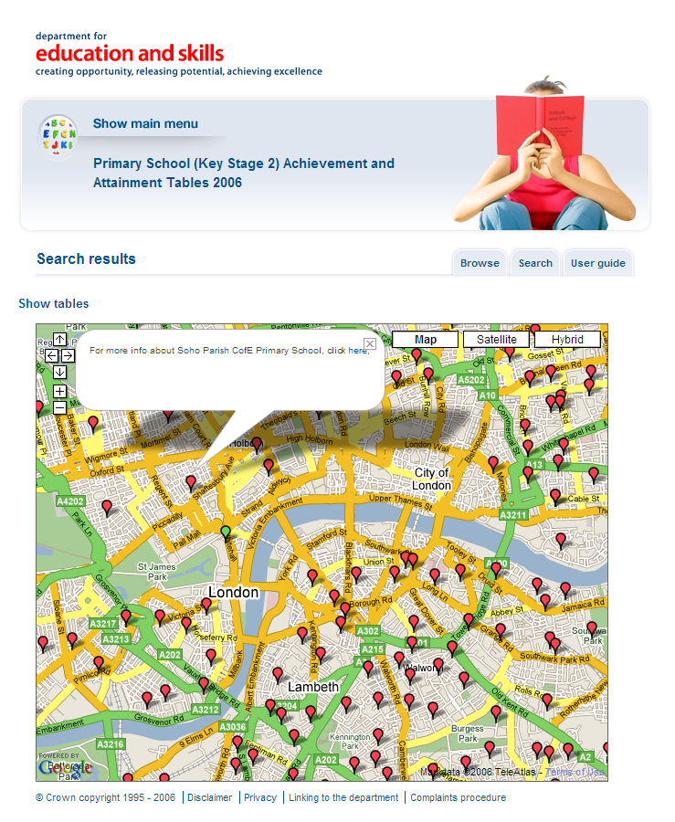
The big leap forward is the use of Google Maps, in what (I think) is government’s first attempt at a ‘mashup’. Type in your postcode and a distance in miles, and you’ll see a good-sized Google Map showing your location, and all the primary schools in the immediate vicinity, as pointers on the map. Click on a pointer to see the school’s name, and click again to see its numbers. (Each school’s page also includes a mini-map, which is still click-and-draggable.)
We also did some nice things in terms of the presentation. If you choose to browse by region, then by local authority, you’ll see all the schools in that authority area as a big table… with some nice rollover effects on both rows and columns. Rows was easy; but as anyone with any HTML knowledge will know, columns is a bit trickier. 😉
 Of course, now it’s live, I’m left thinking about the extra things I wish I could have done, if time and budgets hadn’t been a factor. There are a few rough edges, and it’s not in true ‘house style’ (since it was coded months before the departmental rebrand). I’d like to have kept the various table headers fixed, and scrolled only the data rows. Of course, the ability to sort the data would have been brilliant for the end users – but we weren’t allowed to do that for political reasons.
Personally, I think the mapping brings a whole new dimension to the data, helping me consume quite a large amount of data within a (geographic) context I understand. No apologies for using Google Maps, as opposed to Ordnance Survey: I’m afraid the free functionality, and its ease of use, was too good to refuse. We played by the Web 2.0 rulebook, rather than the public sector conventions, and I think it paid off big-time. But I’d love to know what other people think.
Responses
Simon,
It’s gratifying to see that all of the hard work on the performance tables site has finally come to fruition.
It was a particularly interesting project, and one for which Cimex was happy to provide our expertise through the creation of these new page layouts and the excellent new Google maps integration – I’m glad they’ve finally seen the light of day.
Hopefully it might just garner some more press over the coming days and weeks.
Cheers,
Andy Hawkes
Head of Web Development
Cimex
And allow me to endorse the efforts of Cimex in getting it all stitched together. I’m only sorry it didn’t go live *much* earlier in the year, as intended.
It’s always a pleasure to work on projects that offer something different and allow us to flex our creative muscles – long may it continue.