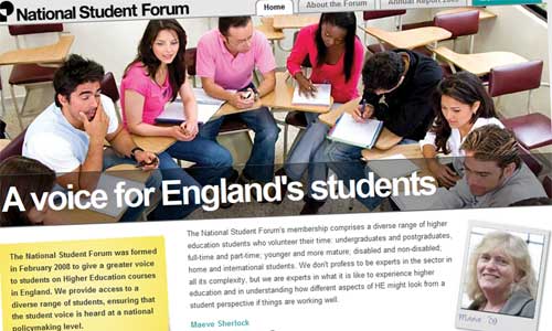
Today sees the launch of the latest little site we’ve built on behalf of – or more accurately, in collaboration with – BIS, the Department for Business Innovation and Skills. It’s a pretty straightforward WordPress build for something called the National Student Forum: a panel representing HE students’ interests, whose latest annual report was published this morning.
It started out as a fairly simple project, to do the ‘commentable document’ thing around the new Annual Report. But it soon became obvious that, for various practical and structural reasons, the only sensible thing to do was to remake the Forum’s entire site. (Er, all half a dozen pages of it.) And although it’s still a fairly small site, it’s been built with future flexibility in mind, should it ever be needed.
I’ve put a lot of work into the visual aspects this time: it’s a big, bold design drawing heavily on the style of the printed publication. There’s a cute little routine which allows you to specify the header image for a given page. We’re using Scribd.com to host the PDF files, allowing us to embed them back into our pages with Flash; but I’ve used a bit of Javascript to hold it all back until it’s required. The site will use comment threading, which isn’t (yet?) the norm: I’ll be watching to see if the users are comfortable with it. And all turned round in less than a week. A fun job.