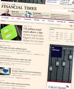
 Is it just me, or is the new Financial Times website design, being rolled out progressively this week, heavily influenced by blogs – and remarkably reminiscent of the Downing Street site?
Whilst other sites seem keen to cram ever more into their homepages, the new FT homepage makes the site feel really quite small. Just ten ‘top stories’ in a list, sorted in order of importance; headlines and very brief excerpts, with timestamps, categories and related articles. There are still plenty of sections and subsections; but the primary navigation is mainly hidden behind dropdowns (Javascript-enhanced HTML blocks rather than traditional form dropdowns, incidentally). The page layout is (broadly speaking) three columns: fat, thin, thin – a configuration we’ve grown familiar with in the blogosphere.
Gawker.com shares my take, and concludes: ‘the online medium continues to assert its precedence over print; even the rich love blogs; and bloggers all deserve to be paid more money’. No argument on any front there. 🙂
It’s further evidence, in my mind, that the divisions between ‘blogs’ and ‘proper websites’, ‘blogging tools’ and ‘proper CMSes’ have disappeared, if they were ever there to begin with. Let’s just ignore the labelling. Blogs and blogging systems evolved as a means for writers to get news items up on the web quickly and efficiently. Guess what – journalists want to get their news items up on the web quickly and efficiently. So do (should?) press officers.
In my own work, once the decision is made to use a blogging tool (ie WordPress), certain design decisions are basically inevitable. But it’s very interesting to see the FT choosing to make many of those same design decisions, without any (apparent) requirement to do so.