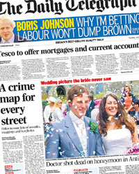
Wednesday saw the formal launch of London’s crime maps, which first appeared in beta only a couple of weeks back. Don’t call it ‘1.0’ though: the source code declares it’s actually ‘beta 1.02’.
As before, it shows areas colour-coded for the rates of ‘burglary, robbery and vehicle crime’, based on comparisons with ‘the average’. Yes, that’s an approach which has its limitations – my favourite being that areas containing police stations tend to rate worst for offences, because of (for example) finding drugs on someone you’ve just taken into the custody suite. But as a first step, it’s surely a good one. There are plenty of legal and logistical issues to overcome before we start putting dots on the map according to offences… and as we all know by now, if you try to sort everything out before going live, you never go live.
No mention of the total cost in the official press release, but I’ve seen a figure of £210,000 reported (eg Daily Mail). Given that it’s a fairly straightforward map mashup, using the standard infoWindows and polygons built into the (free) Google Maps interface, I’d be very interested to see a confirmation and/or breakdown of that. Fair play to Boris and his Conservative administration for getting it out the door early; but the next ‘how much did that government website cost?’ argument could be interesting.
Meanwhile, I see the Foreign Office is doing some map mashing of its own, with a cute (rather than useful) map of travel advice notices for the home nations’ World Cup qualifiers. But crucially, they’ve done it using the free ‘My Maps’ functionality; and it’s offered purely as an external link, not even an embed on the FCO page.
 Crime mapping is front-page news today (in the