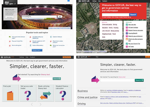
The date for transition from Directgov to GovUK is fast approaching, and we now have a sight of the homepage which will greet visitors on opening day. And as GDS head of design Ben Terrett acknowledges, ‘it’s significantly different from any of the other homepages we’ve released so far’.
Back in April last year, when a small group of people were starting to think about an alpha for GOV.UK, the expression “Google is the homepage” was coined… People often misunderstood this to mean we thought the homepage should look like Google. We compounded this problem by making the homepage look like Google.

A brief review of previous iterations shows just how deeply that thinking went. Note in particular the one with a Google Maps aerial photo being used as a zero-effort equivalent of Google’s ‘doodles’.
This isn’t the only instance of ‘inspiration → implementation’ in the GovUK design, by the way. When Ben was appointed, he wrote on the GDS blog:
In many ways the problem is similar to problem [Jock] Kinnear [sic] and [Margaret] Calvert faced when designing the road signs in the 60′s. Kinnear and Calvert proposed one consistent system. One designed with the clarity of information as it’s [sic] goal. From then on Britain had a solution that became the definitive standard and was copied around the world… Sound familiar? Swap signage systems for websites. Swap vehicle traffic for online traffic. That’s a challenge no designer could resist.
Six months later, which typeface did they choose as the new design’s base? (New) Transport, Margaret Calvert’s digital-friendly update of said 1960s road sign work. Well, I suppose that’s one way to meet said challenge. But I digress.
Instead of trying to emulate Google, they’ve switched to more of a signposting strategy – which looks more like (very) old-school Yahoo. (Or indeed, Directgov.) A bold decision, which almost feels like a backward step… but a decision based on evidence. It all leads to a fascinating conclusion, which Ben describes as follows.
The people who visit the homepage do so because they are lost. They’re not on the right page, and they’re not comfortable using search, so they go to the homepage to try and help them find what they’re looking for.
Or, if I might dare to paraphrase, your own on-site search isn’t worth worrying too much about. If they’re going to be comfortable doing with the concept of searching, they’ll almost certainly have come to you from Google (65% of traffic) anyway. (All the more reason, I’d say, for using Google Custom Search or the paid-for Site Search.)
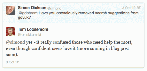
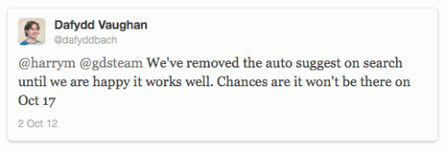
The move also coincides with the removal of one of my favourite features of previous iterations: search suggestions as you type. When done well, it’s an invaluable navigation tool in itself: and in fact, I’m now finding myself expecting to be offered search suggestions, when I start typing into the Search box of any large-scale site.

But it may not be gone for good:

I look forward to reading that forthcoming blog post. (Update: now published.)