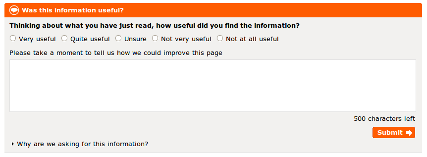
To their great credit, Directgov have added a feedback box to the bottom of nearly every page on the site, asking how useful you find the page contents. Responses are anonymous, and there’s some nice javascript to aid usability: a jQuery-based character count and validation check prior to submission. The language is maybe a bit formal, and it looks like the rating is mandatory without actually saying so; but I’m nitpicking.
My suspicion is, it’s actually a pretty modest email form: nothing particularly advanced. But it’s a significant step forward, and perhaps, a step closer to the Tories’ stated vision of government websites as ‘places where people can come together to discuss issues and solve problems’. (And don’t forget, Directgov’s API has been promised ‘by the end of May’.)
Responses
Agreed, its a good sign, easy-in, low commitment, stay anon if you want.
I have had similar on a gov.uk site for a number of years and I have two comments.
1) there is no turing test, so someone will be spending a lot of time sorting through spammy posts, maybe there is a load of miraculous algorithms behind this box which magics them away, but still a simple 2+2 = turing test is
a) understandable by those whose native tongue is not english
b) a simple 2nd step that most people can understand the need for.
2) part of step 2 should be to ask if ppl want a reply, and if so to optionally enter a) their email address
Making the process 2 step ( and the second step kick in an optional turing test – say for those whose IP is not in the UK?) can have the effect of reducing spam by a large amount (totally in my case), and you can optionally engage with those members of the public who desire it.
Just some notes from further down the same road, but then again maybe the idea of the box on Direct.gov.uk is not to engage at all – which would be understandable, but sad.
I missed that bit about Directgov’s API. What was said?
I’ll check out the tweet subtitles version of the speech too, might have more insight.