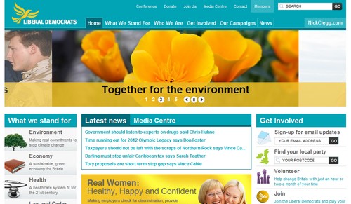
There are quite a few surprises in the new Liberal Democrats website, launched today. First of all, and quite a relief, is that it’s not predominantly yellow / gold / orange for once. Secondly, curiously, is that it’s been built – and is apparently hosted – in Belfast. We’ll come back to that in a moment.
I rather liked the old LibDem site: it was a bit cold, and a bit ugly, but I felt it laid the groundwork for some interesting things going forward. For its replacement, more effort has clearly been put into the aesthetics, hitting you with a big and brutal image carousel at the top of the homepage. Unfortunately, it seems to have come at the expense of the features which made the old site interesting. Gone (as far as I can tell) is the collection of data from external sources such as MPs’ blogs, TheyWorkForYou, or Flock Together; and you’ll need to dig into the ‘media centre’ to find any outbound RSS – no autodiscovery on the homepage, tsk tsk.
Mark Pack recently wrote a spot-on piece about reviewing political websites, stating that you should only judge them on whether they meet the objectives they set for themselves. So how does this one measure up? Well, according to the site, here’s what the party stands for:
If you want things to be different, really different, choose the party that is different – the Liberal Democrats. There is hope for a different future, a different way of doing things in Britain, if we’re brave enough to make a fresh start. Change for real, change for good.
Does the website communicate these values? Is it ‘really different’, ‘brave’, ‘a fresh start’? Hand on heart, I can’t say that it is. The design feels dated, and whilst it’s built around a solid enough core structure, there’s nothing really inspiring. In fact, as redesigns go, it’s rather conservative (small ‘c’).
And then there’s the Northern Ireland thing. On the homepage, there’s a map of the British Isles (plural) highlighting the site’s postcode search function: rather curious for a party which doesn’t actually stand (directly) in Northern Ireland, never mind the Republic. And if you enter a Northern Ireland postcode into the search box, it responds with a (polite) error message. Yet there’s an explicit reference to ‘N Ireland’ in the footer, which links directly to their sister Alliance Party’s site – without obvious reciprocity. Er…? Now I admit, I’m from that part of the world, I notice these things – but I’d have thought their Belfast-based design agency would have too. (Of course, it’s quite a coup for a Belfast agency to win the contract for a party which has barely a token official presence locally.)
The LibDems have a lot of work to do presentationally over the next six months. They need to differentiate themselves positively from the competition, in a climate where ‘they’re all as bad as each other’ (regardless of what the evidence says). They need to manage the transition from ‘rural’ to ‘urban’, as the Tories reclaim seats they’d lost, and Labour lose seats they’ve held. They need to claim the mantle of ‘the party of real change’ (although that’s going to be a tall order). And like all parties, they need to enthuse their supporter base. And I’m afraid this isn’t the website to do any of that.
Update: The party’s marketing chief, David Loxton explains the changes in a post at Lib Dem Voice. The primary objective seems to have been simplification – and I’d agree, it probably achieves that, although I stand by my comments last night about it failing to match the party’s stated core values. The prospect of ‘new social action network site’ sounds interesting though, and not a million miles away from MyConservatives.com.