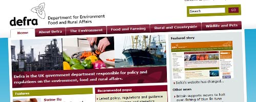
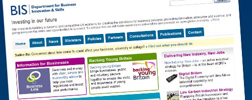
Two major departmental website changes (that I’m aware of?) today – a completely transformed website for Defra, and a new look for BIS’s corporate site.

The Defra site feels like an incremental improvement of what went before. Gone is the blocky layout and earthy (and somewhat apt?) colour palette, replaced by the de facto standard tabs and colour gradients, and a slightly esoteric colour scheme. It’s clear a lot of thought has gone into site structure, particularly at the upper levels: a friendly homepage highlighting good feature content, and meaningful tabs.
I like it. But it’s a bit disappointing to learn that ‘[they’ve] had to change the web addresses for most of [their] information’ – and I think they’ve missed a trick by not at least trying to redirect some of the key pages.

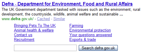
For example, when you search Google for Defra, you get a list of eight key pages as well as the site homepage – ‘bringing pets to the UK’, ‘animal health & welfare’, ‘your questions answered’ and so on. Only two of these eight links lead anywhere still meaningful. It should only take a minute to add a few ‘301 redirects’ manually. And there’s still no RSS on the site. Grr. These days, I have to say, I think it’s a must-have. Even a reference to the feed generated by COI’s NDS-generated feed would be a help, guys.

BIS meanwhile have changed the design of their ‘pulled together in 3 days‘ corporate site: it now looks much more serious, considered, and dare I say it, conventional. I don’t mean that as a criticism; but the previous incarnation felt so much more agile, innovative even, and I’m going to miss having it there as a wonderful case study. Sniff.
The great news is, it’s still running on WordPress. So in fact, it’s probably just as useful a case study: proof that WordPress can do ‘conventional’ too, if that’s what you want. And with the volume of content in the new site structure, it looks like it’s there to stay for a bit longer, too. Steph and Neil have a bit more to say, including details of some interesting things happening behind the scenes: and fair play again to Steph for open-sourcing his coding work.
Responses
I know what you mean Simon, but the user experience of some bits of the 1.0 site was pretty ropey, even if it was innovative. The fact that it’s WordPress still is quite important – I’d argue the innovation is in a site still built and managed in-house for no external budget bar hosting, which still feels a bit like it’s powered by an enterprise CMS (and I’ve written up the furtively innovative RSS stuff).
Incidentally, working on things like implementing a left hand navigation was a real pleasure in WordPress – you just feel like there’s always a way to do what you want, probably in the form a well-documented template tag or blog post somewhere, and normally implementable within 15 minutes.
Sssssh, don’t tell everyone.