Conference season is as good a time as any to refresh a political party website. The LibDems did it last week; this week it’s Labour’s turn; and we’re already hearing details of a new Tory site for next week.
So is this finally the recognition of Labour’s previous online under-performance? Er, no it’s not. It’s bright, it’s red, and it seems (finally!) to have settled on a consistent logo and typeface. The homepage concentrates on latest news and ‘calls to action’. There’s a box of ‘local news’, and a feed from its Labourspace social network. All good stuff in theory, but the execution – editorially and technically – is frankly awful.
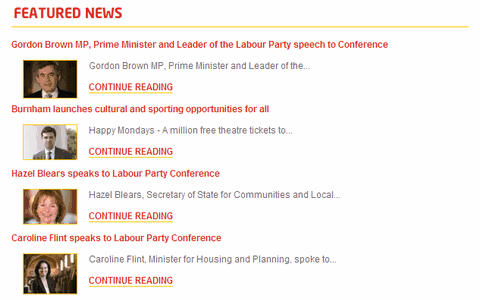
Let’s look at the news side first. Look at the appalling use of headline and (remarkably limited) summary space:

So in the week of Labour’s big showpiece public event, with a lovely stage set and lectern and everything, we get a series of ultra-boring file photos. Headlines which tell us precisely nothing that we hadn’t already guessed. And – unbelievably! – nine word summaries, which repeat the anodyne headlines, word for word. (The ‘Happy Mondays’ reference is an honourable exception, especially given the conference venue.)
And to make matters worse… the site’s RSS feed repeats exactly the same content. Even if someone took a design decision that short summaries were cool, why on earth wouldn’t Labour be putting out full-text RSS? It’s not as if they need to attract eyeballs to the site to satisfy advertisers. (It doesn’t validate, either.)
The ‘local Labour news’ is getting its headlines randomly from local Party sites -most, or possibly all, built on the Party’s official web platform, provided by TangentLabs. Except, more often than not, something doesn’t quite work. Quite often, I’m seeing stories with no summary. This shouldn’t be happening on a high-profile homepage; and certainly not if it’s sites created by the same company.
And as for the ‘call to action’ stuff? OK, let’s give it a try. I enter my postcode under ‘EVENTS NEAR ME’ – and get zero events in return. I enter my postcode under ‘LABOUR IN YOUR AREA’ – and it tells me where I live, and who’s standing in next year’s European elections. No mention of any local Labour Party. There’s a tantalising reference to ‘Area Map’… but no map. I enter my postcode under VOLUNTEER – and it gives me a lengthy form to fill in, with (mercifully, at least) my postcode pre-entered.
To be honest, I can’t face digging any deeper. The site simply doesn’t look finished.
Responses
Simon, have you actually looked at the site? Instead of talking about it offering, for the first time in UK politics, grassroot fundraising tools, you talk about the number of words in the summarys. Instead of talking about peer to peer recruitment or viral messaging you talk about the occasional external article not displaying text. I can’t help but think that there’s major sour grapes at play here – given the laughable job your company did with the Number 10 site. Generally respect your analysis but i think you’re way off here.
I just need to clarify: my company didn’t ‘do’ the Number 10 website. We advised on the implementation of the WordPress platform, but the site design and build was entirely done by someone else (New Media Maze).
If there are groundbreaking new tools in there, that’s great. My point – and I stand by this – was that the top layer made such fundamental mistakes that it turned me off immediately.