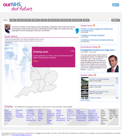
 One of my favourite projects over the last year has been Our NHS, Our Future – the website for Lord Darzi’s review of the NHS. With the review entering its final stages, we’ve taken the opportunity to give the site a lick of paint, and reworked the homepage.
Reflecting the local focus of the review, the centrepiece of the new homepage is a great big clickable map showing England broken up into its Strategic Health Authorities. Each SHA is publishing a ‘vision document’ over the next month or so: clicking the map will generate a popup with a news story about the document, or a ‘coming soon’ message. It’s all being done with PHP and Javascript, so the site manager only has to write and publish his story: everything else is automated from there. We’re also hoping to get photos from each launch event, which will get added into the map’s popups via Flickr’s tag feeds. (Not a huge enhancement: we’ve been consuming YouTube RSS feeds since last year.)
This is the third iteration of the website in nine months: we launched initially in late August using Typepad, but moved to WordPress in November as Typepad showed its limitations. It perfectly demonstrates the value in adopting a blogging platform as your CMS: sure, the (base) content type is primitive… but it means the job of tweaking, redesigning or even migrating becomes so much easier.
Response
I hadn’t realised you were involved in that site. I’m managing some NHS blogs in a pilot scheme at talk.nhs.uk and it too used to use TypePad but is now using… Community Server 🙁 WordPress would be so much easier, but I assume they need intergration with the main NHS site which is Sharepoint powered so needed to be an ASP based solution.