 Just how easy is it to set up a cash-generating business in the world of web 2.0? Well, with a little time on my hands to experiment, I decided to find out. And within three working days, and for a total cash outlay of £30, we are live.
A month or two back, Google unveiled a new feature which allows you to ‘create your own search engine’. Basically, you specify all the sites you do or don’t want to be included in searches, and Google does all the other boring stuff, like hosting, ranking, indexing, and all that. If you’re an expert in your field, and you know ‘all the good websites’, you can create a search function with all the benefits of Google’s expertise, all the benefits of your experience, and none of the bad stuff. It’s effectively bringing the editorial function to the chaotic anarchy of search, and the implications are truly huge.
 You’re welcome, then, to www.findless.co.uk – a new editorialised search engine network. Why ‘findless’? Well, aside from hopefully being memorable, it sums up our philosophy that ‘less is more’ when it comes to search results. We’ve all seen the heatmaps: startling numbers of people instinctively click on the first search result in the list. All the more important, then, to strip out all the sites whose SEO may be great, but whose content may be lacking. Most people we’ve asked immediately think it’s an odd choice of name… but pretty soon, they get it.
We’re starting with two areas, chosen because we (my wife and I) have worked in the fields in question, and know the good sites without having to think too hard. One is health and safety, the other is education. Coincidentally, in both cases, the quality information is spread very widely, and you may not instinctively know where to look.
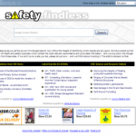
The homepage template features a great big search box, with a great big font – all very 2.0. Beneath, we’re running the headlines from selected websites in the field, driven largely by the sites which bother to offer RSS feeds. The effect, hopefully, is close to a pre-emptively personalised Google homepage. We’ve also stuck an Amazon affiliate box on there, just to see what happens. Type in your keyword, press ‘submit’, and Google basically takes it from there. The basic layout template is ours, but as a trained eye will instantly spot, we soon hand over control to Google, its results and its adverts.
The feedback loop is covered by (guess what) WordPress. If people want to suggest a site for inclusion on our whitelist (which we list in full), they can leave a blog comment, and we’ll have a look. But we’re maintaining absolute editorial control. If we like a site suggested by a reader, we’ll include it. If we don’t like it, we won’t. Yes of course it’s subjective, but that’s kind of the whole point.
How so cheap? We’re using hosting provided by Danish company one.com, whose basic package comes to a trifling £0.90 per month (ex VAT), for 1000MB of disk space and no (formal) bandwidth limit. Even including a £9 setup fee, and domain name registration, it still totals barely £30 for a year’s service. All accounts include a MySQL database, and are ASP/PHP-enabled. Powering the feedback loop / blog area, naturally, is the open-source WordPress and having done it a few times now, installation was a breeze. The Google function is free, paid for by their cut of the pay-per-click advertising revenue. I’m using a free PHP script to pull in the RSS feeds, and cache them. Google Analytics is keeping track of usage.
I’m not expecting this to fund my retirement; in fact, if it covers its costs, I’ll be delighted. But it’s been fun to go from zero to revenue-generating business in a matter of a few days, and a useful learning experience. I’m more convinced than ever that tools like PHP and WordPress are the future of small and even mid-sized websites for individuals and businesses. The cost of raw materials is, increasingly, negligible if not zero… but the need for experienced experts is paramount.
I’d love to hear what people think of it (unless you want to complain about the formatting problem in IE6… I know all about it already, thanks!). Please leave a comment, either here or on the findless blog.
Responses
Nice idea. Really quick, first reaction, design comments…
1. Lose the blue findless.co.uk band from the masthead. It shouldn’t have that degree of ownership of the page.
You’ve got two separate audiences; education and health & safety. The value of the sites is in their domain specific results. Brand clarity of each site should trump the small venn crowd of educational health and safety people.
Also that alignment of right hand edges between the blue bar and the other content feels awkward.
2. Lose that weird grey faux marble scratch box behind the Education search box. The colour and image balance on safety.findless is much better. But with both more white space, less is more etc.
You do need to improve the relationship between the search bar and the logo, but that will be a lot easier without the blue masthead band. Extra whitespace means you should be able to shrink the logo while giving it more impact.
3. Reduce the font size in the search bar. I like big too, but at the moment it is too big.
4. That copy explaining site purpose can be distilled into one strapline; something like “Meaningful education results” or “less searching, more results”
Also centre alignment of text is weird.
5. Simple links “Suggest a site”, “Findless blog”, “Safety Findless” is all you need on the homepage for the other bit.
6. It would be nice if DfES outputted their RSS in Sentence case. Can you modify this either through some smart code? (or get them to do at the contribution end :P)
7. I’d also look at losing the coloured bar with RSS feed titles. These could be done effectively in coloured type. Once again more white space…
Good luck with it.
Hi Richard, thanks for the free design consultation. 🙂 Plenty of valid points in there. I’ll look at implementing some, if not all. This project was always more about the technology than the visuals, though… and to be honest, I’m keen to move on to the next project ASAP. My work here is (more or less) done.
Hi Simon
Good idea, and quite similar to one I have put into place at LGSearch – which is based on local government websites. Currently limited to councils, I’ll be including other local authorities, like police and fire, in due course. If you have a poke round the site, you’ll find we too have a WordPress blog, and I am putting into place a wiki at the moment.
I have a feeling that the whole thing will become bigger than just the search though, and have plans for a larger project focussing on the spreading of social media best practice within local government. I’m in conversation with Steve Dale at IDeA about much of this – if you’d like to join in let me know – briggs dot dave at gmail dot com.
Simon,
I was going to point you to the search engine set up by Dave Briggs – http://lgsearch.net – but see he has beaten me to it. I think that Google is onto a real winner here – the potential for incorporating the functionality into personal web sites and blogs is almost infinite. I’m looking to use the personalised search as a co-operative resource inside the local gov Communities of Practice platform (http://www.communities.idea.gov.uk/home.do). Will bookmark your site for future reference.
Steve Dale
Simon, Nice thinking and it all looks good. Site design starts off as a personal kind of thing refinded by feed back and visitor rates. Shame you are considering leaving it for the next project as it has loads of potential. I have also tried creating my own search site which you can find at http://search.sizenet.com Thanks to Google the opportunities are endless, I agree they are on to a winner.
[…] Simon Dickson, a consultant ‘bringing new media thinking to UK news and government’, has launched Findless (pronounced Find-less, rather than Findluss, which was my original reading!): […]
[…] Simon Dickson, a consultant ‘bringing new media thinking to UK news and government’, has launched Findless (pronounced Find-less, rather than Findluss, which was my original reading!): […]
This is a comment. To delete comments please go to dashboard and click manage and either approve, delete and mark spam.
Mrs WordPress Helping Agian