When WordPress gets boring, things get interesting


[Thanks to @JonAkwue for suggesting a vastly improved headline for this piece…]
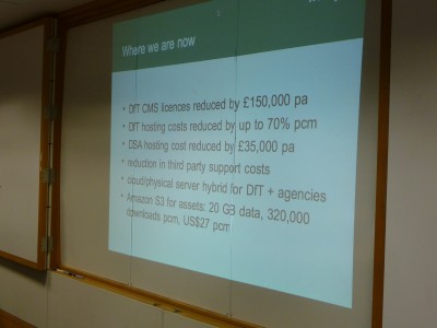
The big moment of this year’s Word Up Whitehall came in the second presentation of the day: Gavin Dispain from the Department for Transport, telling the story of their hasty migration to WordPress.
It was already clear that we were in very different territory from last year’s inaugural event: Stephen and Francis from Health had opened with a presentation featuring the kind of technical architecture diagrams you just don’t see at WordCamps. We weren’t just talking about the potential for government departments to use WordPress, or sharing examples of little microsites they’d built: no, this was real corporate-sized heavy-duty stuff. And there, at the heart of it, increasingly so in fact, was WordPress.
Then came Gavin, and that slide. He didn’t really make a big deal of it. I think we all knew about the potential to generate massive savings. But there it was, in black and white: hundreds of thousands of real pounds, not notional pounds, saved at a stroke. With further savings to come, as more arms-length agencies come on-board. (Defra are a bit further down that track already, as David Pearson related later in the day.)

Technical architecture diagrams. PowerPoint slides with incomprehensibly large numbers on them. Weren’t these precisely the things which drove me out of ‘proper’ IT, and into the world of WordPress? What the hell were these doing at a WordPress event? For a moment I could feel myself switching off, as I’d done in countless meetings over the years.
And that’s when it all suddenly fell into place.
I’d reacted against such things in the past, because they were visions of the future – and for the most part, futures that never quite arrived. But something was different here. People weren’t talking about how they could or would do it. They were demonstrating how they had done it. Health had built that structure, and it was working. Transport had left behind one set of contracts costing £X, and were now in a new arrangement costing £Y.
To be frank, systems admin and accountancy can be a bit boring. But it’s a mark of the success of the WordPress mission1, and the potential it has unlocked, that we’re now into that business-as-usual territory. When you’re getting stuck into the ‘boring’ bits, that’s when change is really happening.
And it turns out, I don’t actually hate technical architecture diagrams and budget forecasts after all.
1 When I first drafted this, I wasn’t sure about using the word ‘mission’. But then, by sheer coincidence, Seth Godin posts a few lines on his blog, and I feel a whole lot better about it.

Dept of Health switches to WordPress


Congratulations to Stephen Hale and the team at DH for finally making the leap, and moving their corporate web presence over to WordPress.
Stephen hinted at such a move back in February, when he blogged about their successful use of WP for a number of subsites: ‘having dipped a toe in,’ he wrote, ‘it’s tempting to go a bit further than we originally planned.’ Clearly though, Stephen’s plans have moved on quite a bit since the start of the year: in a blog post last week, he described this as ‘phase 2 of 4’ (!).
As with our work for Defra, they’ve opted not to redesign the site: it still looks (broadly) the same as it did, although not identical, and the trained eye will spot a more WordPress-friendly approach to sidebars and things. Nor have they migrated most of the old content: it will remain accessible until it’s out of date, at which point it’ll be moved to an (unspecified) archive. I don’t think anyone would call that a perfect solution, but these are cash-strapped times, and it’s almost certainly good enough.
The project – driven by Steph Gray, including some input from Mike Little – is based on HealthPress, the same TwentyTen-based child theme Steph developed for those aforementioned subsites. Back in February, I wrote that the code ‘isn’t pushing the technology’s boundaries too hard’ – and really, that’s still the case. But I stress, I don’t write that as a criticism. It’s to Steph’s great credit, and that of WordPress itself of course, that he’s made the site work with just a vanilla WP instance. Amazing what you can do with posts & pages, tags & categories, a bunch of widgets, and a few ‘usual suspect’ plugins.
Stephen very kindly referenced the Word Up Whitehall event from last October as having provided ‘a moment of epiphany’: if there’s a direct line to be drawn from there to here, then I’m absolutely delighted my little get-together served its purpose. Maybe it’s time for a follow-up.
That’s now four Whitehall departments running their primary websites on WordPress: Transport, Health, Defra and the Wales Office; plus Downing Street, of course, and several – Cabinet Office, BIS, DFID, DECC – using it for secondary elements of their corporate websites.
So does that make it the most used ‘CMS’ for Whitehall departments’ primary sites? I rather think it might. 😀

WordPress at Dept of Health

Just a brief post to highlight Stephen Hale’s write-up about WordPress usage at the Department of Health, answering the question I posed in a tweet last week:

Just how many WordPress based sites is @hmshale running over at @dhgovuk?

… to which the answer is, one or two more than I had spotted.
It’s all Steph Gray‘s handiwork, commissioned through Steria, with a child theme of the default Twenty Ten. I’m sure Steph would agree that it isn’t pushing the technology’s boundaries too hard; but it doesn’t need to. Stephen’s team’s needs have been met, allowing them to spin off high-quality subsites, quickly and efficiently, when requirements land on his desk – and indeed, Stephen observes: ‘I think the theme will exceed our expectations for it.’ I look forward to Steph’s write-up of the work; it’s highly unusual for him not to have posted something by now.
There’s a very interesting sign-off to the piece, too:

I don’t need to tell you that using a straightforward publishing tool like WordPress is fairly pleasing. Having dipped a toe in, it’s tempting to go a bit further than we originally planned.

Whatever could he mean? 😉

DH reveals £2.7m Adwords spend

A parliamentary question has revealed that, in the year to the end of January 2010, the Department of Health spent £2.72 million on Google Adwords pay-per-click keyword advertising. A big number, but a fair one?
With Google’s Adwords advertising, you only pay on results. An advert is displayed at the top, or down the side of a set of Google search results for a given keyword or phrase; or, optionally, on third-party web pages where Google’s matching technology decides your keyword is relevant. Plus, Google’s technology allows for geo-targeting, so in the case of DH, they can specify ‘UK only’. (Of course, DH is only responsible for England, but that’s for another day.) So in theory at least – we know that people were looking for something health-related; they saw an advert from DH/the NHS; they decided it was of interest; they clicked on it, and were taken to a DH website. Job done.
A couple of factors to bear in mind. There has been a trend towards campaign calls-to-action based on search terms: ‘search online for X’ – and in the free-for-all of Google search ranking, the only way to truly guarantee visibility at the top of the page is to pay Google for the privilege. If it works as a call-to-action, and you have to pay for it, then so be it. And it’s a competitive business – where government finds itself going head-to-head against pharmaceutical companies. Top ranking can cost a lot of money.
DH is rightly cautious about disclosing too much data, citing competitive confidentiality. Similarly, Google doesn’t tell you as much as you might like about ‘what keyword X will cost you’. But their Traffic Estimator provides some clues.
If we look at ‘chlamydia’ for example: Google’s tool suggests that a bid of 30-43p per click will buy you a position in the top 3 adverts for the term, leading to 62-86 clicks per day. That’s something like £27.50 per day, or £10,000 a year. Now of course, Google’s screen layout means there’s a significant premium to being the no1 ‘sponsored link’ – and you might well consider it worth bidding high to guarantee top spot, particularly in the case of chlamydia, where the NHS site is the no2 ‘natural’ result.
For the term ‘stop smoking’, Google’s tool suggests a bid of £1.66 to £2.50 per click, to secure a top 3 slot resulting in 49-68 clicks per day. So for a similar volume of traffic, that’d be well over £100 per day – and an annual cost in the region of £42,500. Why so much more expensive? – because the NHS is in direct competition with bids from anti-smoking drugs, devices and consultants. One wonders what premium they’re paying to guarantee no1 position there – but the Google tool suggests a maximum bid-per-click of over £6, taking us well into six figure annual budgets.
Time and again, when you search for something health-related on Google, there’s an NHS sponsored link at the top of the page. They, or rather we, are paying good money for this. You’ve got to assume someone’s looking at the numbers, and deciding it’s worthwhile. Just because it’s a big number, doesn’t necessarily mean it isn’t cost-effective. It may surprise some people for me to say this – but some things on the web are worth paying for.

Photo-sharing function for Health consultation


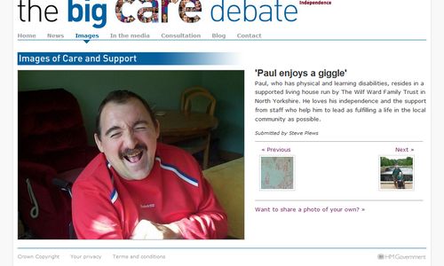
One of my longest-running projects has been the consultation around Care and Support, and the creation of a National Care Service. It’s been a huge engagement process on many fronts, moving through numerous phases – and the website has reflected that, with frequent changes, additions and updates.
The latest enhancement went live last week – and effectively grafts Flickr-like photo functionality on top of WordPress. We’re asking people to submit photos which illustrate the issue from their perspective, with the prospect of including the best ones in the White Paper due later this year.
Now I’ll confess, I wasn’t too convinced by the idea initially. Would we get any response at all? Would the photos be any good? Would people take the issues seriously? But I’m happy to admit my instincts were wrong this time: yes, people are sending in their photos, and yes, some of them are fantastic.
The upload function is based around the TDO Mini Forms plugin: not always the easiest to work with, but it opens up all sorts of possibilities. In a perfect world we’d maybe have tried to do a really slick upload form: TDOMF relies on an iframe, with some downside in terms of usability. But it’s good enough, and it was up and running in next to no time. All submissions are moderated prior to publication: and thankfully, TDOMF makes this as easy as normal WP comments.
If you know Flickr, you’ll immediately see echoes of its design in the custom templates I’ve done – and yes, that’s entirely deliberate. Since it’s fulfilling the same basic purpose, it made sense to use the same basic presentation. We considered using Flickr itself, but didn’t feel too comfortable with its rules on ‘commercial’ groups: maybe we could have pleaded non-profit status, but it wasn’t worth spending time on. (Comment functionality is of course present on the site; but it was decided not to open comments on these pages.)
I doubt there’s a place for this in many consultations; but I’m glad we’ve been able to prove it can be done – and that there are people out there, willing to get involved. A soft engagement success story in the making, I hope.

We care a lot

bigcaredebate
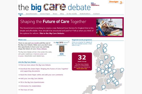
One of my bigger projects this year has been the website for the Care And Support green paper, aka The Big Care Debate. Basically, the country is in desperate need of a new funding model for long-term care of the elderly and disabled: and in July, three funding options were put forward for consideration. And we’ve been trying various things, online and offline, to engage people in the debate.
When the green paper was published, we did a Commentariat-style ‘commentable document’; there’s also an interactive on-screen questionnaire, with or without a ‘face morphing’ app which shows what you might look like when you’re old. (I can’t claim any credit for that last element btw.) Meanwhile, in the real world, there have been a series of ‘roadshows’ for public and stakeholders – as shown on the clickable homepage map. You’ll also note, if you click on places like Peterborough, Derby or Coventry, that the team have taken a digital camera with them, and are posting snaps on Flickr. Then there’s the Campaign Monitor email list, the Twitter account, the Facebook activity (official and unofficial)…
The response has been huge, and often angry. The site has received more than 3,500 user comments, the majority of which have been to a single page of the commentable document: there’s clearly been a concerted campaign among interest groups to make their opposition known. There’s also been a healthy volume of comments on the campaign’s blog, written – you’ll note – in the name of the lead official, rather than a politician (although that hasn’t stopped people constantly raising the issue of politicians’ expenses claims).
In truth, on occasions, it’s been too much. At one point, we feared the site had been hacked: in fact, we’d just hit the limit imposed by our hosting company on outgoing emails. (Turned out, it was too many people asking to receive email notification of follow-up comments.) If you don’t count Downing Street petitions, it must rank as one of the highest volumes of responses to a government consultation exercise.
Now let’s be honest: most of the feedback has not been complimentary. There are a lot of people who think the changes are designed to cut their current benefits; and anything the Government tries to do at the moment is being met with disillusionment, cynicism and antipathy. So is it a bad thing to have received so many defensive, angry, confrontational comments? Personally, I don’t think so. Negative feedback is still valid feedback. It highlights the areas where there have been problems, if only communication problems. And it gives you a mailing list of people you need to contact, to make your case.
We’re now into the final month of the consultation, which – for some people, I dare say – is a relief. By any volume metric, I’m confident the process will be counted a success. But of course, the only meaningful measure of success is whether or not it yields a workable proposal with general public approval. In the current political climate, I fear that may be too much to ask. Still, I hope the web element has done its bit.

Change 4 Life: govt's flexible brand

change4lifefont
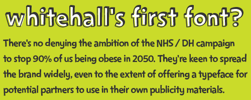
You’ll be seeing a lot of the Change 4 Life brand, and the associated bright Morph-esque characters whose aim in life is to tackle the growing problem of obesity. But whatever you do, don’t call it a government campaign, though – it’s a ‘society-wide movement’. Which essentially means, it’ll be everywhere: online and offline.
I’m almost becoming blasé about seeing government accounts on Flickr and YouTube. But they’ve done it particularly well, with the YouTube videos obviously kept short, and the Flickr photos being more than just ‘Minister shaking hands with‘ (although it’s a shame they’re ‘All rights reserved’).
The defining characteristic of this campaign – sorry, movement – will be ubiquity, through brand extension. DH is offering the full range of design assets for download from its website; and ‘services or products provided or commissioned by the NHS or local authorities’ are being encouraged to use the Change4Life name, logo and sub-brands. They’re also being encouraged to think up their own sub-brands; and whilst it isn’t permitted to just add ‘4 Life’ on the end of an organisation name, the design guidelines imply an open approach. A good few household names are signed up as members of the ‘business 4 Life coalition’ – although that in itself has attracted some criticism already.
Not for the first time, the campaign’s online call to action is to do a search; on the ads I’ve seen so far, no actual URL is quoted. It’s a risky strategy, but I guess there’s evidence to show that it worked OK on previous campaigns (?).
The website is a subdirectory of nhs.uk, but there’s no hint of NHS branding – in fact, no mention of government at all, other than a Crown copyright reference in the footer. There are reasonable attempts at interactivity. I like the postcode search listing all sorts of active activities near you, with a Microsoft Virtual Earth map, and a link into Transport Direct for directions. But the function to create your own character is a bit of a mess: choose a colour, height, and one of half a dozen poses… hardly much in the way of customisation… then, as far as I can tell, nothing. My customised Morph has yet to make his promised return to greet me.
The main objective of the site, at first glance, is to make me sign up for an information pack. Nothing inherently wrong with that, of course… but it could have been so much more. A personal diet/weight tracker, maybe. Some kind of ‘introduce me to a local sports club’ function. Even some kind of blogging / discussion forum thing. But as it stands, I don’t see any reason for me ever to return for a second visit.
Mind you, if the objective is to get me to go outside and run around, maybe that’s deliberate.

Capita to take over NHS Choices

I see today that Capita has been named as the preferred bidder for the £60m+ contract to run the NHS Choices website for the next 3 years – ahead of the incumbent, the Dr Foster Intelligence public-private partnership, as well as IBM, Serco and TATA.
According to Capita’s own press release:

Capita will be responsible for the hosting, technical and content development of the NHS online presence and related digital services. A key focus will be on ensuring innovative engagement with citizens and clinicians to support a healthier nation.

As many as 70 companies expressed an interest when the procurement exercise kicked off late last year. The current contract is due to expire next month.
It’s clearly a big deal, and although I’ve done quite a bit of work lately for the Department of Health and NHS, I don’t know what the implications of a change would be. Anyone care to enlighten us all?

Department of Health redesign

The new Department of Health site is a definite improvement; the previous incarnation looked like it had been designed primarily by the technical side (which, indeed, it had). Now it’s all colourful boxes with rounded corners and shaded colourings, and it’s all the better for it. All this without breaking links, apparently.
Well done to them for trailing the new design in a ‘coming soon’ page, made available for a couple of weeks before the changeover. And even better, I love the review of old designs. I wonder how many of us kept screengrabs of old sites? I know I’ve lost all trace of some previous ‘masterpieces’.