Australia wants Drupal-based gov-wide CMS

Canberra is planning on doing a GOVUK: developing a single ‘Whole-Of-Government Content Management System’ for Australia. And they’re very clear on what they want: ‘The solution must use Drupal open-source software‘.
Why Drupal? They’ve published a detailed report (PDF) on their decision. They had two key requirements: that it must be ‘truly Open Source’, and very much unlike GOVUK, that it ‘must not be a .NET or Ruby based solution’. Well well well.
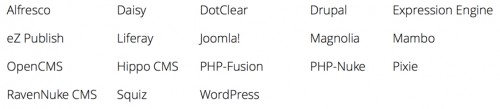
There were 18 options on a long-list:
Australian Gov CMS longlist
which they assessed using various criteria, and came up with the following scores:
au-gov-CMS-assessment
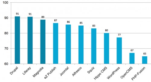
The top three were then considered in more depth, with Drupal actually coming out third of the three in most cases, and its user experience coming in for particular criticism. But in the end they’ve opted for Drupal primarily, it seems, because of the availability of extension modules and (local) developer resource.
Obviously it’s more than a little disappointing to see WordPress ranking so low: but not entirely surprising. Nobody is currently tasked with representing the WordPress platform as, say, Acquia does for Drupal. (By the way – have a look at the list of open job vacancies at Acquia, including many in the UK. And compare that to the equivalent Automattic list. Quite a contrast in approaches.)
But it’s a victory for Open Source nonetheless – and an explicit recognition of the value of the sizeable community behind the Drupal platform. It’s exactly what I talked about in 2011, when I took GDS to task for building the GOVUK platform from scratch, ignoring the benefits (immediate and future) of working with an established external platform. And took a fair bit of flak for it.
It gets better: they’ve posted an explicit commitment to feed back into Drupal core. ‘It was unclear whether GovCMS intends to give back to the community,’ they admit: ‘it was always a clear intention of GovCMS to do this, we have made the statement more direct, and the Draft Deed of Standing Offer document clarifies this requirement further.’
If you fancy the work, tender responses need to be in by the end of the month.

Buzzfeed listicles have no place on GOVUK. Do I really need to write that?

Her Majesty’s Government has made occasional forays into the world of Buzzfeed. I thought the Foreign Office’s use of the platform to rebut claims by Russia Today was quite amusing, and entirely appropriate. A very serious message presented in an ultra digestible format.
Earlier this week, someone in UK central government (the Treasury?) put together a list of 12 things you could buy with the £1,400 that Scottish people are better off per capita by remaining in the UK… and posted it on Buzzfeed. Complete with photos of Lego scenes.
Now I have to say, I don’t feel at all comfortable with Whitehall, the Civil Service, the organs of state taking a position on the Scottish referendum like this.
I agree entirely with the assertion (posted on a gov.uk explanatory page) that ‘there is a demand for the provision of information which will enable voters to come to an informed decision’. If the conclusion arising from unbiased consideration is clearly in one direction rather than the other, they should say that.
But they should do so whilst standing clearly outside the fray. If the Yes campaign wins, Whitehall needs to negotiate a smooth exit from the Union, having been an active combatant on the opposite side. It means they would enter any such negotiations at an immediate and irretrievable disadvantage.
If they are going to take a stance, and campaign actively in its favour, they might as well articulate their conclusions in a digestible format (listicle), and post it in an appropriate place (Buzzfeed). Yes, it might create a few ripples in the Scottish media – and indeed it has: they probably wanted that anyway. But it’s easy to shrug off. Sure, it’s Buzzfeed. What do you expect?
But I think it’s a huge mistake to bring that into the universally acclaimed gov.uk site, as they have now done. Steph Gray describes it beautifully in a post on his Postbureaucrat blog.

Library content answers questions… It has credibility, and a certain longevity, if maintained appropriately. These days, GOV.UK is the natural home for most library content in central government.

Café content is what you create to get people talking. (It) needs to exist in the context of a solid strategy, and often will point people to your library content where they can find out more, sign up for something, join a campaign or give you their feedback.

Keep the library and the cafe distinct spaces, and find out how best to make them work together.

He also points to the deeply troubling ‘imaginable situation’ of the civil service being instructed to campaign for exit from the EU. And I now wish he hadn’t.

New CERT-UK website will be shortlived

Maude at Sprint 14. Pic: gdsteam on Flickr

If Puffbox was still on active service, it would already have brought to your attention the news that:

The number of government websites is increasing despite a high-profile cull, Francis Maude has revealed. The Cabinet Office minister said his officials were engaged in a “nightmarish game of ‘splat the rat'”. “As soon as you knock one website on the head another one pops up,” he told a government IT conference in London. Mr Maude said all sites – including those for government agencies – would either be axed or moved into the gov.uk domain by the end of the year. “There is no reason why every single bit of government should have its own unique web presence,” he told the SPRINT 14 conference. “It’s complicated and it’s expensive and we don’t need to do it.’

Government websites on rise again despite cull‘, BBC website, 29.01.2014
See also: speech on gov.uk

Sadly Francis apparently missed the opportunity to mention this when, earlier today, he stood up on a stage to launch the 55-strong Computer Emergency Response Team UK (CERT-UK). New organisation… guess what? New website.
I only take some modest consolation from the fact that it’s running on WordPress… WP Engine, in fact, as demonstrated by the fact you can access the site via certuklive.wpengine.com.
CERT-UK’s director, Chris Gibson proudly declared at the launch event: ‘Numerous government departments (such as the Government Digital Service who built our website and other technology) have assisted us.’
If that’s true – why does it say ‘Built by Surevine’ in the footer of every page on that website, not to mention the theme’s stylesheet? Why would GDS help prolong its boss’s rat-splatting nightmare?
Surevine, meanwhile, are keen to tell you about their participation in Open Source – ‘it’s core to what we do,’ they say. But their claim to being ‘active’ in the WordPress community is something of a stretch – given that their sole contribution appears to be a single plugin connecting to their own node.js web service, posted not in the official repo but on Github. It’s being watched by a total of 14 people, the overwhelming majority of whom are Surevine staff.
There are plenty of other nits I could pick. But what’s the point? The site will be shut down in 276 days tops. Won’t it?

'The Emperor's New Clothes'

If you have any interest in the Directgov->GovUK transition, you are hereby ordered to make a cuppa and read this by veteran (sorry!) e-government blogger Alan Mather for a bit of historical perspective.
It’s long but it’s important. This isn’t the first time a new unified government website has made big promises. Some things are different this time; much, though, isn’t. ‘Some will take what I say below as an attack on GDS,’ he acknowledges; ‘that’s far from what it is, it’s an attempt to look ahead and see what is coming that will trip it up and so allow action to be taken to avoid the trouble.’

GDS climbdown on 'F#@! IE6' stance

In a post on the (then) Alphagov blog in April last year about design principles:

Given it has 3.5% UK market share and Microsoft are trying to persuade everyone to shift off it, we assumed IE6 is dead (actually, we were a tad ruder than that).

The blog post was illustrated by a photograph showing design principles scribbled on cards, and stuck around the room (which was in the old COI headquarters of Hercules House). See that ‘IE6’ one disappearing off the top? There’s a very good reason why the photo is cropped precisely there. Clue: four letters, begins with F.

On the GDS blog today:

I think this is a well-intentioned mistake. Gov.uk is a clean slate, a rare opportunity to force people to upgrade, for their own good. GDS is a future-oriented operation, charged with leading a revolution in the delivery of public services. Oh – and cutting costs, too. Ask any web developer about the cost, in terms of both person hours and opportunity cost, of supporting IE6.
This effective endorsement of the continued use of an 11 year old browser is entirely contradictory to that mission. Sure, they’d take some flak for it. But it would be an opportunity to promote the message of ‘Government’s preferred online security advice channel’, GetSafeOnline, which states quite categorically: ‘Always ensure that you are running the latest version of your chosen browser.’

Dept of Health's eulogy for WordPress

I feel somewhat obliged to highlight the latest blog post by Stephen Hale, head of digital at the Dept of Health. As regular readers will know, Stephen switched the department’s web publishing strategy over to WordPress just over a year ago, and he’s written subsequently about the joy of making such a move.
The countdown is now well and truly ‘on’ for government’s move to its new bespoke web platform: in less than a week, Directgov and BusinessLink will have been switched off. Government departments’ corporate sites will make the transition over the next few months: initially as ‘islands’, but reaching a critical mass ‘in around February’, according to the Inside Inside Government blog. A post on another Health blog quoted a completion date of April – and that certainly tallies with conversations I’ve had.
All of which leaves Stephen in reflective mood.

In DH, since we switched our main content management tool for dh.gov.uk to WordPress, we’ve expanded the range of people who can publish DH content. We’ve been able to do this because it’s now dead easy for people to do it. WordPress removes complexity for the editor – form relates to function pretty well.
As a result the digital team spend much less time publishing than we once did, and less time training and supporting editors. So we are able to focus more of our effort on ambitious uses of digital for health and care, and our policy engagement work.

– which is exactly the message I have been pushing around Whitehall for several years. How great to see it reflected back on a *.gov.uk website.
Stephen’s post closes:

I’m expecting [with] the publishing tools for the Inside Government bits of GOV.UK … our editors won’t need a manual and a training course to do their jobs. From what I’ve seen, it’s looking good.

Is it just me, or is that a veiled threat? 🙂

On logging in via Facebook

Reported by the Telegraph today:

Those applying via computer or mobile phone for services ranging from tax credits, fishing licences and passports will be asked to choose from a list of familiar log-ins to prove their identity… Under the proposals, members of the public will be able to use log-ins from “trusted” organisations, chosen to appeal to as wide a demographic as possible, to access Government services grouped together on a single website called Gov.uk… A user logging onto the site by phone would be asked to choose to select from a logo from one of the trusted brands, such as Facebook.

Two days ago, on the blog of email newsletter service MailChimp:

[We were convinced] that adding social login buttons to our app were essential to improving our depressing failure rate… I was shocked to see that just 3.4% of the people that visited the login page actually used Facebook or Twitter to log in.
Even a 3.4% drop in failures is worth having them there, right? Maybe not… Do you want to have your users’ login credentials stored in a third-party service? Do you want your brand closely associated with other brands, over which you have no control? Do you want to add additional confusion about login methods on your app? Is it worth it? Nope, it’s not to us.

Of course, the MailChimp position is slightly undermined by the use, immediately below this very blog post, of ‘Sign in with Facebook’ and ‘Sign in with Twitter’ buttons on their comment form. They argue in the comment thread that commenting is a very different user scenario; and it’s a view I have some sympathy with.

GovUK calls off the search

The date for transition from Directgov to GovUK is fast approaching, and we now have a sight of the homepage which will greet visitors on opening day. And as GDS head of design Ben Terrett acknowledges, ‘it’s significantly different from any of the other homepages we’ve released so far’.

Back in April last year, when a small group of people were starting to think about an alpha for GOV.UK, the expression “Google is the homepage” was coined… People often misunderstood this to mean we thought the homepage should look like Google. We compounded this problem by making the homepage look like Google.


A brief review of previous iterations shows just how deeply that thinking went. Note in particular the one with a Google Maps aerial photo being used as a zero-effort equivalent of Google’s ‘doodles’.
This isn’t the only instance of ‘inspiration → implementation’ in the GovUK design, by the way. When Ben was appointed, he wrote on the GDS blog:

In many ways the problem is similar to problem [Jock] Kinnear [sic] and [Margaret] Calvert faced when designing the road signs in the 60′s. Kinnear and Calvert proposed one consistent system. One designed with the clarity of information as it’s [sic] goal. From then on Britain had a solution that became the definitive standard and was copied around the world… Sound familiar? Swap signage systems for websites. Swap vehicle traffic for online traffic. That’s a challenge no designer could resist.

Six months later, which typeface did they choose as the new design’s base? (New) Transport, Margaret Calvert’s digital-friendly update of said 1960s road sign work. Well, I suppose that’s one way to meet said challenge. But I digress.
Instead of trying to emulate Google, they’ve switched to more of a signposting strategy – which looks more like (very) old-school Yahoo. (Or indeed, Directgov.) A bold decision, which almost feels like a backward step… but a decision based on evidence. It all leads to a fascinating conclusion, which Ben describes as follows.

The people who visit the homepage do so because they are lost. They’re not on the right page, and they’re not comfortable using search, so they go to the homepage to try and help them find what they’re looking for.

Or, if I might dare to paraphrase, your own on-site search isn’t worth worrying too much about. If they’re going to be comfortable doing with the concept of searching, they’ll almost certainly have come to you from Google (65% of traffic) anyway. (All the more reason, I’d say, for using Google Custom Search or the paid-for Site Search.)
The move also coincides with the removal of one of my favourite features of previous iterations: search suggestions as you type. When done well, it’s an invaluable navigation tool in itself: and in fact, I’m now finding myself expecting to be offered search suggestions, when I start typing into the Search box of any large-scale site.

But it may not be gone for good:

I look forward to reading that forthcoming blog post. (Update: now published.)

New logos for all government departments


Consistency of government departments’ visual identity has been on the cards for quite some time. In such austere times it’s increasingly indefensible not to; it’s how the citizen sees it anyway; and there’s evidence, from home and abroad, that it can be beneficial. I blogged back in 2010 that, with a new government taking power, it was an idea whose time had come; and the Single Government Domain project was always likely to be the trigger.
A couple of months back, I received a tipoff that the new logo style had been agreed; and that departments were starting to factor it into future comms plans – but I didn’t want to blog about it until the details were made public. Looking through the GDS Github account this morning, I came across a publicly accessible PDF file entitled ‘HMG Identity System’, carrying Cabinet Office branding, dated January 2012, and uploaded in the last fortnight. It confirms the tipoffs I had received.
If you’ve been following the evolution of the gov.uk project, it won’t come as much surprise to learn that each department gets a single identifying colour. (Health get two – one of which is NHS Blue.)  For the most part, the colours will be broadly familiar from existing departmental palettes: Education’s orange is the most striking exception. Departments’ sub-agencies will also fall into the same system, and will inherit the colour of their parent department.

All logos are to be dropped in favour of a digital-friendly Royal Coat of Arms, except for those departments whose current identities use a particular ‘heraldic badge or crest’ – the Home Office and MoD are noted specifically, but I assume the Wales and Scotland Offices would be covered by this too. (NIO’s use of a crest seems somewhat half-hearted, so I guess they’ll use the common one.)
There will also be ‘auxiliary icons’ for use in certain circumstances: the crown as seen already atop gov.uk, and a somewhat unpleasantly squared-off Union Jack.
The document says it can be used in either portrait or landscape orientation, but there’s no indication of how it will handle extra-long names such as Defra’s.
It’s very simple, surprisingly so in fact. The choice of typeface – Helvetica Neue, I assume? – doesn’t immediately say British, in the way that Gill Sans might have done. It’ll be very easy to forge; and, I fear, very easy for arms-length bodies to get wrong. But purely subjectively, I do quite like it.
Update, 11 May:
The ‘new look’ is in fact already ‘out there’, if you know where to look. I’ve had it confirmed by the Dept for Education that they’ve been using it on their website since ‘the start of April’, making them the first dept to do so. However, implementation is patchy: the ‘old’ DfE identity is still in evidence: I’m seeing an old logo as their website’s favicon; on their Facebook page; and despite their claims to have changed it, as their Twitter icon and profile background.

There’s also photographic evidence of the new style in use by the Teaching Agency, a DfE executive agency.
I haven’t yet found evidence of any other departments using it yet. If you have, do please leave a comment.
A bit of extra background for anyone who’s interested:

  • The Dutch government rebranded all ministries with a consistent (royal crest) logo and typeface in late 2007. The work was led by design agency Studio Dumbar. (Warning: Flash heavy.)
  • Canada and Germany have had consistent departmental identities for ages. France adopted a common logo (Marianne) in 1999, but its application is somewhat variable.
  • The introduction of a consistent NHS identity was exemplary: 95% of people now recognise it spontaneously. This website explains what they did, and why.
  • The departments of the Northern Ireland Executive share a common visual identity (hexagon-based logo and typeface): but the website about it seems to have been rationalised. The Scottish government doesn’t appear to have any kind of identity for its Directorates… which I guess is consistency of another kind.