Guardian man is government's new digital director

I have it on very good authority indeed It’s now been confirmed that the new (£142k pa) Executive Director Digital, filling the post currently held by Chris Chant on an interim basis, and advertised back in April, is to be Mike Bracken – digital director at The Guardian until last week.
Computer Weekly makes some interesting – and quite exciting – observations about the management culture he built up:

While GNM has outsourced some IT roles, the company has brought in information architects, analytics and product development managers as a discipline. GNM uses an agile environment for developing web applications and has scrapped project management and business analyst roles to replace them with product managers.

In fact, he sent a tweet to Steph Gray yesterday which seemed to suggest he sees a similar role for ‘product managers’ in government:
[blackbirdpie url=”https://twitter.com/#!/MTBracken/status/71234171762262016″]
To get a flavour of what to expect, fasten your seatbelt and watch this five-minute breakneck presentation on innovation, which he gave to a WPP event last year:

… or this slightly more corporate presentation on deriving benefits from social media, at a Gartner symposium in October. (Fast forward eight minutes to skip the extended intro.) You’ll like what you hear.
Interestingly, in both presentations, he uses the same quote from Simon Willison. How exciting is it to have a new digital director who actually appreciates that:

You can now build working software in less time than it takes to have the meeting to describe it.

Those who know Mike are very complimentary about him: I note William Heath’s description of him last week as ‘one of the UK’s very best new-style CIOs’. On the downside, though, he’s a Liverpool supporter.
Mike’s personal website is at mikebracken.com – and he’s done a post formally announcing the appointment. He runs a couple of Twitter accounts: you’ll probably want to follow his ‘work’ account, @MTBracken.
He starts on 5 July.

The £585 favicon: explanation and justification

The Guardian’s Charles Arthur followed up yesterday’s story about the Information Commissioner’s Office paying £585 for a favicon, and has managed to secure something of an explanation of how it reached such a price.

Though the creation process is quite simple, confirming that it has been done correctly is not: what’s been generated has to be created against a set of “functional specifications” laid out in the contract for the job – colours, sizes, a long array of confirmations quite separate from the task of making the actual item.
That bumps up the time taken to between two and three “billable hours” for the designer, who works at Reading Room based in Soho – one of the UK’s biggest web agencies, with turnover of £12m and 170 staff whose time is charged at £600 per eight-hour day, significantly lower than many in the business.
But the favicon can’t now simply be sent to the ICO site ready for uploading. First the company has to get approval from Capita, which has the contract to manage the site, and which may make its own comments about what it thinks, and at the very least has to check that it’s the correct size; and then from Eduserve, which hosts the site and has to check it can in theory be uploaded; and from the Central Office of Information, which manages the ICO contract with Reading Room.
All in all, getting everyone involved to approve the favicon that has been created means the time taken balloons to a total of nearly seven billable hours – which means Reading Room, as a commercial outfit, charges about £500; add VAT at the rate prevailing in 2010 and you reach £585.

I’m not entirely convinced by the calculation: I wonder just how long that ‘array of confirmations’ could have been for a favicon; I wonder precisely what input Capita, Eduserv and COI could each have had; and I wonder if the £600-a-day designer was actually the member of a 170-strong company spending 4-5 hours on the phone, valiantly trying to push it live. But that’s beside the point: if £585 is commensurate with the effort Reading Room went to, then they should invoice it. There’s no argument there.
The wider point here is that it simply shouldn’t have to cost that – as, indeed, Reading Room’s Margaret Manning seems to accept:

“A lot of government contracts involve outsourcing the IT, which sounds like a great idea in many cases. But if you look at the hoops you have to go through … it can make the amount of time needed by outside organisations just go up and up to get anything done.”
She thinks there is a culture within government which doesn’t try to reduce spending. Instead, she suggests, there is a culture of fear that something will go wrong whenever something is put on the web, which leads to a belt-and-braces approach that in turn pushes up costs and times above what any commercial organisation would spend.
But she’s also perplexed by the choices the government has made. “What commercial entity has Capita running its IT?” she asks rhetorically.

Fair points. And it leaves me wondering… what about those other links in the chain? How much did they bill for their contributions to the process, whatever they were? If Reading Room’s designer is spending 4-5 hours making phone calls, presumably Capita / Eduserv / COI will also be charging for answering the calls? Should we maybe double the £585 figure?
It boils down to this. Process is an insurance policy. Like any insurance policy, you pay a premium. You decide what level of premium you’re prepared to pay, for what cover, and what level of excess. And if you aren’t happy with the cover or service you receive, you go elsewhere next time.
If you bring in an insurance broker, you pay him or her a fee – on the understanding that he or she knows the market better than you, and will act on your behalf to ensure you get the best deal. If that doesn’t happen, you get yourself a new broker, or you do it yourself.
Update: which, actually, makes this tweet from yesterday (which I’d missed at the time) all the more interesting:
[blackbirdpie url=”https://twitter.com/ICOnews/status/33217532274028544″]

DFID's blogs feed new Guardian site


With the kind assistance of the Bill & Melinda Gates Foundation (I think he used to be big in computing or something), the Guardian has launched a new (sub)site dedicated to global development. And quite remarkably, it features regular contributions by UK civil servants.
In fact, it’s feeding (literally) off the DFID Bloggers site, built by Puffbox nearly two years ago (!). It pulls in the latest handful of stories from the DFID site’s RSS feed, and displays them in a cute little animated box. Pretty much what the DFID homepage itself does…
… except that the DFID homepage does something a little bit cleverer. As you’ll see, it carries not only the title and description – typical of any RSS feed; but it also shows the author’s face and job title, neither of which are standard RSS elements. It also turns the blogger’s name into a link to their personal blogging archive. Cool, eh? – dead easy, actually.
We do this with the aid of a little WordPress magic. The author photo is uploaded into WP using a plugin called User Photo; but Simon Wheatley and I worked on a ‘meta plugin’ to ensure these photos would be square, and hence more predictable to work with. And before you ask, yes, the meta plugin was indeed made available at wordpress.org… and has been downloaded over 3,700 times as I write this.
(The job title is an additional field added to the user profile; at the time, we did that with a custom plugin, but now I’d probably use this code by WP guru Peter Westwood.)
We then call this extra info – where available – into the RSS feed with a custom function, using the rss_item hook. (It’s all formatted using the standard MediaRSS extension, originally by Yahoo.) And so, each time a new post is added to the DFID Bloggers site, the DFID homepage can extract all the data it needs from the RSS feed, and slot them into the appropriate box.
… which is a very roundabout way of demonstrating that, contrary to what you may have read lately, there’s plenty of life in RSS yet.

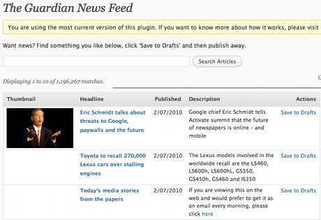
Guardian launches WordPress syndication plugin


On the very day that the Times puts up its paywall, the Guardian goes the complete opposite direction – and unveils a WordPress plugin intended to gets its content out there, on as many other people’s sites as possible, free of charge.
Once you’ve installed the plugin, and signed up for an API key, you get effectively a subeditor’s view of the Guardian’s archives. If you find a story you like, and want to republish, you save it down to your own WordPress installation, then edit and publish it as normal. It even checks stories for updates. Much neater than a DIY solution based on something like the FeedWordPress plugin, and without the potential for licensing headaches… as long as you’re happy enough to leave the credits and adverts in place.
The blogger (or whoever) gets free, simplified access to the Guardian’s content, without licensing worries; the Guardian gets additional attention for its material, a wider spread of advertising impressions, and a PR victory over its Murdoch rivals.
If it sounds like something you’d be interested in, you can download it from WordPress.org.
Update: worth noting Public Strategist’s problems with the plugin: ‘Nowhere in those extensive conditions does it state that the Guardian claims the right to extend that control to the host blog.

Guardian Data Store: threat to ONS or its saviour?

When I first saw reports of the Guardian’s new Data Store ‘open platform’, my heart sank. In a former life, I ran the web operation at the Office for National Statistics; I resigned in June 2004, when frustration started to turn to anger. I’ve still got a copy of my resignation letter, in which I wrote:

I have always maintained that the agenda of openness which I espoused is not a choice; it is a reality forced upon us by the modern communication environment. The general public’s expectations have moved on dramatically in the last decade [1995-2004]. Sadly, this [realisation] has not been shared by other parts of the Office on whom my work or resourcing have been dependent.

I warned them that someone would come along, do a better job than they were doing, and supplant them as the ‘primary source’. Once that happened, the statistical sanctity so jealously guarded by the priesthood of statisticians could very easily be compromised. In effect, to preserve the status quo, things had to change. (The message went unheeded, by the way: the six-month ‘stopgap’ site I introduced is soon to celebrate its seventh birthday.)
So today, the Guardian unveiled their Data Store. Editor-in-chief Alan Rusbridger is absolutely clear about the service’s purpose:

Publishing data has got easier [since 1821] but it brings with it confusion and inaccessibility. How do you know where to look, what is credible or up to date? Official documents are often published as uneditable pdf files – useless for analysis except in ways already done by the organisation itself.

Just to be clear, ONS: that’s you he’s talking about. It’s expressed even more starkly in an accompanying blog post by Simon Rogers, subtitled: ‘Looking for stats and facts? This is now the place to come.‘ A quick look down the data on offer reveals a high proportion, a majority perhaps, to be ONS or other HMG data. Their tanks are on your lawn, guys.
Now I’m not for one minute suggesting the Guardian would do anything malicious. I’m simply warning of the uncomfortable position where an outside entity – indeed, in this case, one with an explicit political slant – becomes the gatekeeper to (supposedly) pure statistical data. Can we rely on them to be as comprehensive, as conscientious, as religious in their devotion to updates, corrections and revisions? No, admits Simon Rogers: ‘it is not comprehensive… this is selective’.
So is this the Doomsday Scenario I predicted? Not quite, not yet. How exactly are the Guardian serving up the data?

We’ve chosen Google Spreadsheets to host these data sets as the service offers some nice features for people who want to take the data and use it elsewhere [in] a selection of output formats including Excel, HTML, Acrobat PDF, text and csv. A key reason for choosing Google Spreadsheets to publish our data is not just the user-friendly sharing functionality but also the programmatic access it offers directly into the data. There is an API that will enable developers to build applications using the data, too.

You read that right: the actual mechanics are as basic as: uploading/copying existing Excel spreadsheets, converting/pasting them into Google Docs spreadsheets (price: £0 for 5000 reasonably-sized files), and letting the Google functionality do the rest. By way of example, data on England’s population by sex and race. The Guardian offers this Google Spreadsheet. Now download this Excel file from the ONS website, and look at the sheet labelled ‘Datasheet’. Actually, let me save you the bother: they’re identical.
Cabinet Office minister Tom Watson writes on his blog: ‘Governments should be doing this. Governments will be doing it. The question is how long will it take us to catch up.’ The answer is, the few seconds it takes to sign up for a Google account, and maybe an hour of copy-and-paste. So, tomorrow lunchtime, then.
This afternoon, I thought this was a disaster for ONS’s future. I’ve changed my mind. The Guardian’s move sets a precedent, and lays down a direct, unavoidable challenge. It could actually be ONS’s salvation.

New Comment Is Free adds 'blog of comments'

A big day for the Guardian today, as the new community-enabled Comment Is Free makes its debut. Site editor Georgina Henry describes the various mechanical and presentational changes, but one in particular catches my eye.
Each user of the site now has a personal profile page… featuring an ‘instant archive’ of all the comments they’ve added to Cif articles. It’s the realisation of the ‘blog of comments’ concept I described a year ago, prior to the launch of the Telegraph’s own blogging platform:

Every time I add a comment to a Telegraph news story (for example), it would get aggregated on a ‘personal profile’ page… in other words, a de facto ‘news blog’. You automatically see the headline (and first paragraph?) of the story I commented on, followed by what I thought. It lets me write what is effectively a news-driven blog, but does a lot of the copy-and-paste work for me.

The presentation of these profile pages is pretty dreadful. It’s little more than a few lines of metadata, followed by something resembling search results. No customisation options, no uploaded ‘buddy icons’, no RSS feed per user*, no in-profile navigation (other than pagination), no sort options.
So there’s a very long way to go before these profiles become recognised as ‘blogs’. But make no mistake, that’s what they are. It’s blogging without the overhead, and it ties the blogger ever closer to the Guardian brand and site (whose primary navigation Cif now shares).
* In fact, the new Cif’s lack of RSS overall is a real shame. Cif’s biggest problem is that there’s just too much of it. A single RSS feed, covering all topics, isn’t much help. I really hope these are a feature of the topic-based ‘subsites’ Georgina refers to. They’re getting RSS and subject filtering so right elsewhere on the Guardian site… but Cif needs it more than any other section.

Here is the news

Some very interesting numbers from Robin Goad at Hitwise, showing just how dominant (or not, he concludes) the BBC News website is in the UK news market.

What I find most interesting is the mix of news providers in this ranking. You’ve got broadcasters, newspapers, portals and aggregators (both social and automated), with no one grouping particularly dominant over any other. The Daily Mail has gone from nowhere to being the national #2; meanwhile, the Independent’s radical redesign has yet to really pay off. And look at the Guardian: below the Telegraph, below Sky News even.
‘The market share of BBC News in the category has increased slightly over the last 3 years,’ Robin observes; ‘but at the same time overall visits to the News and Media category have increased at a much faster rate, and most of this increased traffic has gone to non-BBC sites.’ This, he suggests, ‘points to a healthy and competitive online market in the UK, not one dominated by one player.’
Personally, I’m looking at a market being led by one provider whose share (based on the table above, anyway) adds up to significantly more than its 14 nearest competitors put together. How dominant do you want?

No10 Twittering is front-page news


A bit of a surprise this morning to discover that the venerable Today Programme is on Twitter… with its first tentative tweets as far back as September last year, and a (more or less) daily service since December. The username ‘todaytrial’ doesn’t imply that it’s being taken too seriously… although it’s built into their BBC website pages. I suspect someone may now be regretting that choice of username. And it’s a rather incestuous ‘Following’ list, consisting solely of other BBC services.
Downing Street‘s Twitter efforts are front page news in the Guardian this morning – see the actual text here – which should help them pass the 1500 friends mark imminently. Meanwhile, it looks like the Tories are taking Twitter more seriously, with updates being written in Twhirl – and, intriguingly, nothing from Twitterfeed in a few days. Still only a modest 60-odd friends, though. That Labour account is still nothing more than Twitterfeeding, with no indication if it’s official or not, and an even more modest 21 followers.
PS: I see a few other recent political additions to the Twittersphere include Boris Johnson – who appears to be texting them in; and Comment Is Free, for whom Twitter might be the key to making the whole CiF experience more practical. @brianpaddick has been at it since January; if it’s official, @kenlivingstone is leaving it a bit late.