Consistency of government departments’ visual identity has been on the cards for quite some time. In such austere times it’s increasingly indefensible not to; it’s how the citizen sees it anyway; and there’s evidence, from home and abroad, that it can be beneficial. I blogged back in 2010 that, with a new government taking power, it was an idea whose time had come; and the Single Government Domain project was always likely to be the trigger.
A couple of months back, I received a tipoff that the new logo style had been agreed; and that departments were starting to factor it into future comms plans – but I didn’t want to blog about it until the details were made public. Looking through the GDS Github account this morning, I came across a publicly accessible PDF file entitled ‘HMG Identity System’, carrying Cabinet Office branding, dated January 2012, and uploaded in the last fortnight. It confirms the tipoffs I had received.
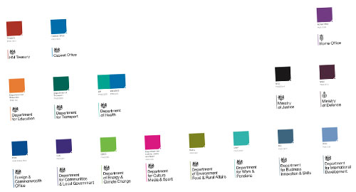
If you’ve been following the evolution of the gov.uk project, it won’t come as much surprise to learn that each department gets a single identifying colour. (Health get two – one of which is NHS Blue.) For the most part, the colours will be broadly familiar from existing departmental palettes: Education’s orange is the most striking exception. Departments’ sub-agencies will also fall into the same system, and will inherit the colour of their parent department.

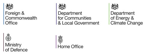
All logos are to be dropped in favour of a digital-friendly Royal Coat of Arms, except for those departments whose current identities use a particular ‘heraldic badge or crest’ – the Home Office and MoD are noted specifically, but I assume the Wales and Scotland Offices would be covered by this too. (NIO’s use of a crest seems somewhat half-hearted, so I guess they’ll use the common one.)
There will also be ‘auxiliary icons’ for use in certain circumstances: the crown as seen already atop gov.uk, and a somewhat unpleasantly squared-off Union Jack.
The document says it can be used in either portrait or landscape orientation, but there’s no indication of how it will handle extra-long names such as Defra’s.
It’s very simple, surprisingly so in fact. The choice of typeface – Helvetica Neue, I assume? – doesn’t immediately say British, in the way that Gill Sans might have done. It’ll be very easy to forge; and, I fear, very easy for arms-length bodies to get wrong. But purely subjectively, I do quite like it.
Update, 11 May:
The ‘new look’ is in fact already ‘out there’, if you know where to look. I’ve had it confirmed by the Dept for Education that they’ve been using it on their website since ‘the start of April’, making them the first dept to do so. However, implementation is patchy: the ‘old’ DfE identity is still in evidence: I’m seeing an old logo as their website’s favicon; on their Facebook page; and despite their claims to have changed it, as their Twitter icon and profile background.

There’s also photographic evidence of the new style in use by the Teaching Agency, a DfE executive agency.
I haven’t yet found evidence of any other departments using it yet. If you have, do please leave a comment.
A bit of extra background for anyone who’s interested:
- The Dutch government rebranded all ministries with a consistent (royal crest) logo and typeface in late 2007. The work was led by design agency Studio Dumbar. (Warning: Flash heavy.)
- Canada and Germany have had consistent departmental identities for ages. France adopted a common logo (Marianne) in 1999, but its application is somewhat variable.
- The introduction of a consistent NHS identity was exemplary: 95% of people now recognise it spontaneously. This website explains what they did, and why.
- The departments of the Northern Ireland Executive share a common visual identity (hexagon-based logo and typeface): but the website about it seems to have been rationalised. The Scottish government doesn’t appear to have any kind of identity for its Directorates… which I guess is consistency of another kind.
Responses
Well spotted Simon.
A sensible move, and I generally like the look and simplicity and logic of the scheme.
However, I think the use of Gills San would be better, partly because it’s currently used in a quite a number of government logos.
I also think that Union Flag needs sorting out…
Boring, boring, boring.
What’s wrong with different departments having some individual distinction to their logos, especially if they highlight their core work (e.g. Culture)?
And I note they can’t even get the names correct. The Department FOR Transport is wrongly called the Department OF Transport in the pdf.
Clever communication and political move. Australia did something similar in 2002 from memory. Every department shares a common ‘Australian Government’ brand which by default, changes the emphasis and perception of initiatives from departmental to overarching government initiatives. Comes in handy, particularly if budgets are tight and you’re facing an election at some point…
@mark
I wouldn’t agree the design is boring.
I think the current system is confusing, wastes money, and does not represent a unified government brand strategy.
It appears the graphics were (presumably) part of a proposal,for new logos, and not the final version that will used, were more documentation will required in a connected style guide.
For an example of a full style guide see http://www.tfl.gov.uk/corporate/media/12523.aspx
The Telegraph carried Simon’s story but without credit http://www.demsoc.org/blog/2012/05/09/government-logo-pseudo-scandal-rent-a-quote-but-dont-give-credit/
I notice the PDF file has disappeared now! Any chance you could upload or email it, it seems like it would be worth a look. (Or a grimace…)
🙂
This might seem a bit weird… but even though I’ve still got a copy of said document (isn’t version control great!), I’m not going to post it online, or send it to anyone.
Given that I do so much work in and around government, I’ve known this was on the cards for some time. If I’d been wanting to ‘break the news’, I’d have done so months ago. I only wrote the article now because the document had been posted in a public space (specifically, Github).
If the document has now been pulled, then it’s been pulled for a reason. And I’m going to respect that. Sorry.