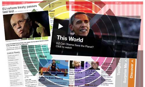
There’s a fascinating (and lengthy) post on the BBC’s internet blog, setting the scene for a forthcoming ‘post-2.0’ redesign of its web presence. It’s a design geek’s paradise – global visual languages, grid systems, typography and colour palettes.
Intriguingly, they start their potted history of the BBC website with a screenshot from December 1997. My own memories go further back, to the days when the BBC’s URL was bbcnc.org.uk – and one particular landmark in page design. White with a dark blue left-hand column; some kind of HTML table magic. Groundbreaking in its own small way.
Pretty soon, all websites looked like that – many, no doubt, deliberately doing so because if it was good enough for the BBC, it was good enough for them. So it’s a pretty big deal when they now announce that they’re ‘moving away from left hand navigation to consistently placed, horizontal navigation across the site.’
I haven’t designed many sites lately which used any kind of conventional left-hand nav; but I have built a few sites which integrated into existing ‘look and feel’ which did still have left-hand nav – and it felt very strange. Blogs and the ‘tab’ metaphor have effectively killed it off.
Another interesting trend from the Beeb’s work-in-progress is the overlaying of big headline text on imagery. For an organisation which produces so much imagery, it’s a fairly obvious thing to do: and it may ‘raise the bar’ for other sites with pretensions to similar scale. Pages without pictures are going to look pretty dull in comparison.
And it looks like we’re going to see a conscious effort to underline the real-time aspects: I note the various mockups marked ‘ADDED 3 MINS [ago]’. Again, if you’re running a large website and you aren’t demonstrably keeping your core content similarly up-to-date, you’re going to look bad – and risk losing trust.
If you want to know what your website will look like in a year or two, have a peek. Do I like it? Yes, yes I do.